Although web components were introduced in 2011, they aren’t the average developer’s first or second choice for composing UI layouts, despite what the technology offers.

This is partly due to an increase in JavaScript frameworks, component-driven development enthusiasts, and other esoteric factors over the years.
Now, in comes Shoelace, a UI library built on web component technology that offers the same experience as any JavaScript framework but with better perks.
In this article, we’ll introduce Shoelace, look at its internal fucntions, and demonstrate how to use its components with React to build a simple interface.
Jump ahead:
To follow along with this tutorial, you’ll need the following:
Shoelace is an open source, framework-agnostic component for building accessible web applications.
Unlike conventional UI libraries that export user interface components and elements specific to a particular framework, Shoelace provides a collection of highly customizable UI components built on a framework-agnostic technology known as web components.
A web component is a composition of standard web technologies that lets you create reusable custom elements or components that encapsulate functionalities and styles away from the rest of your code.
The web component specification is made up of three technologies:
<template> and <slot>) that enable you to create markup templates that aren’t rendered until called uponThese technologies are used together to create web components with encapsulated functionality.
Check out the docs to learn more about the web component specification.
Frontend frameworks such as Angular, React, and Vue.js are built on the concept of using component-driven development to create an organized UI of components that encapsulates content, functionality, and styling into a single JavaScript file.
Although this does alleviate the complex constraints present in web development, it does have a few shortcomings:
Web components are meant to solve these problems.
Shoelace is built on web component technology. It exports HTML and DOM standard components that are supported by every modern browser and work across different frameworks.
There are many benefits to using Shoelace; here are a few:
Installing Shoelace is as simple as adding a <script></script> tag to your project’s document. However, not every framework offers inbuilt support for web components.
For example, the React render tree doesn’t properly propagate events emitted by a web component. To address this issue, Shoelace created wrappers that let us use web components in React.
There are three official ways to integrate Shoelace into a project:
In this article, we’ll be using React to demonstrate Shoelace’s usage. Since Shoelace uses a wrapper for React, we can only install the library locally using npm.
For the purposes of this demo, I’ll assume you already have a React project set up. Now, go ahead and install Shoelace with the following command:
npm install @shoelace-style/shoelace
With Shoelace installed, you can start using its components by importing them into your components, like so:
import { SlInput } from "@shoelace-style/shoelace/dist/react";
function App() {
  return (
    <div className="App ">
      <SlInput value={"David"} label="Name" />
    </div>
  );
}

export default App;
As you can see, Shoelace components are imported as React components instead of the actual custom elements. This is peculiar to React alone; the <SlButton> component in the above code will be imported as a <sl-button> custom element in other frameworks like Vue, Svelte, or Angular.
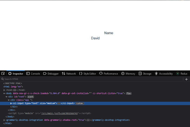
The above code will render a barebones input element to the browser, but without a default style:
Shoelace components are designed to be highly compatible with the different theming systems your project might have. You can choose between a light or dark theme or create a custom theme out of the box.
The theme you add to your project will determine the default style of your components. For example, say you add the light theme to your project by linking the stylesheet to your project’s App.js file:
import "./App.css";
import { SlInput } from "@shoelace-style/shoelace/dist/react";

//light theme stylesheet
import "@shoelace-style/shoelace/dist/themes/light.css";

function App() {
  return (
    <div className="App">
      <SlInput value={"David"} label="Name" />
    </div>
  );
}

export default App;
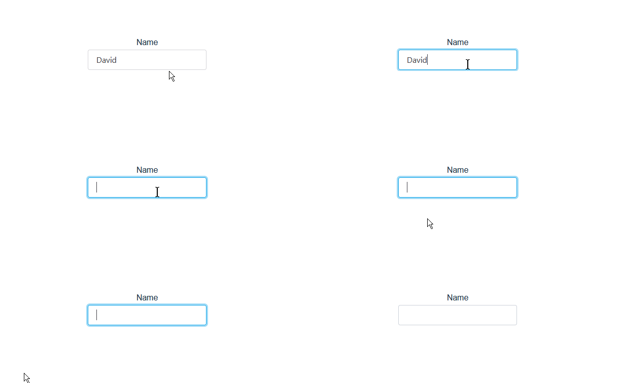
The input component will render with a default style (in this case, determined by the light theme), like so:
If you add the dark theme instead, the component will render with a default style that corresponds to that theme:
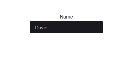
Unlike the light theme, to use the dark theme, you must activate it after importing the stylesheet into your project. You can do this by adding sl-theme-dark to the className on the parent div inside the App.js file, like so:
//dark theme stylesheet
import "@shoelace-style/shoelace/dist/themes/dark.css";

function App() {

  return (
    <div className="App sl-theme-dark">
      <SlInput value={"hello"} />
    </div>
  );
}

export default App;
By now, you should have a basic understanding of how Shoelace works and how to integrate it into a React project.
Next, let’s create a composition to get a better look at the internal functionalities of Shoelace components.
Shoelace offers unique components that you won’t find in many other framework libraries. Components such as image composer and split panel really push the idea of what’s possible with the library.
For our sample project, we’ll build a card component with a button and gear icon that fires an event when clicked.
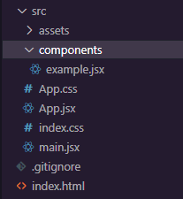
If you’d like to follow along with the example project, create a components folder in the src folder and add a card.jsx file:
Next, import the card component into the App.js file and add it to the return section:
//App.jsx
import { useState } from "react";
import "./App.css";
import Example from "./components/example";

function App() {
  return (
    <div className="App">
      <Example />
    </div>
  );
}

export default App;
Now, you’ll need to import all the components that you’ll be using for the entirety of the tutorial inside the card.jsx file:
//example.js
import {
  SlButton,
  SlCard,
  SlDrawer,
  SlIconButton,
  SlDialog,
  SlSwitch,
} from "@shoelace-style/shoelace/dist/react";
With that done, it’s time to start composing cards!
In the component’s body, declare the <Slcard> component and nest the following code inside:
<SlCard style={{ maxWidth: "300px" }} >
<img
  src="https://images.unsplash.com/photo-1667120651808-34305af680d3?ixlib=rb-4.0.3&ixid=MnwxMjA3fDB8MHxwaG90by1wYWdlfHx8fGVufDB8fHx8&auto=format&fit=crop&w=1736&q=80"
  alt="A squirrel sits on a wood."
  slot="image"
/>
<strong>Squirrel</strong>
<br />
<p>Squirrels are members of the family Sciuridae, a family that includes…</p>
<br />
<small>6 weeks old</small>
<div slot="footer"
 style={{
    display: "flex",
    alignItems: "center",
    justifyContent: "space-between",
 }}
>
  <SlButton variant="primary" pill>
    More Info
  </SlButton>
  <SlIconButton
    name="gear"
  ></SlIconButton>
</div>
</SlCard>
Here, we added an image, heading, and description to the card using the img, strong, and small elements. We also added a footer with a div and nested the Shoelace button and icon components:
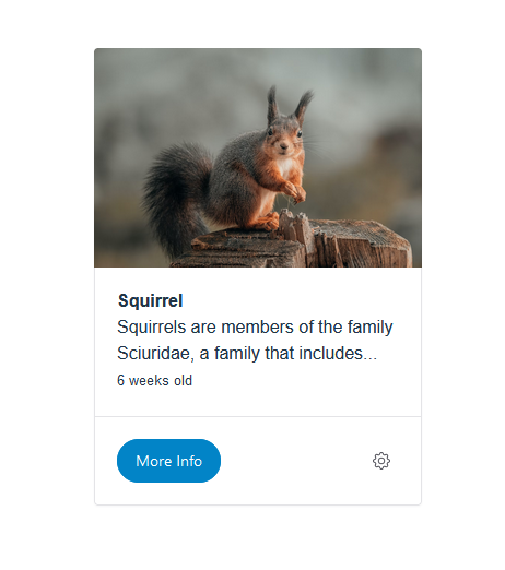
Be sure to set the basepath for Shoelace assets in the App.jsx file before importing and using assets like icons:
//App.jsx
import { setBasePath } from "@shoelace-style/shoelace/dist/utilities/base-path";
setBasePath(
  "https://cdn.jsdelivr.net/npm/@shoelace-style/[email protected]/dist/"
);
The slot attribute on the img and div tags is a Shoelace property that some web components use to accept contents inside it. In our project, we’re using it to define our card composition’s image and footer section.
The slot attribute tells the component where to place the element it’s called on. Take the div with the footer slot, for example, if you put the code at the top of the card component, just before the img tag:
<SlCard style={{ maxWidth: "300px" }}>
<div slot="footer"
   style={{
      display: "flex",
      alignItems: "center",
      justifyContent: "space-between",
   }}
  >
    <SlButton variant="primary" pill>
      More Info
    </SlButton>
    <SlIconButton
      name="gear"
    ></SlIconButton>
  </div>
  <img
    src="https://images.unsplash.com/photo-1667120651808-34305af680d3?ixlib=rb-4.0.3&ixid=MnwxMjA3fDB8MHxwaG90by1wYWdlfHx8fGVufDB8fHx8&auto=format&fit=crop&w=1736&q=80"
    alt="A squirrel sits on a wood."
    slot="image"
  />
  <strong>Squirrel</strong>
  <br />
  <p>Squirrels are members of the family Sciuridae, a family that includes…</p>
  <br />
  <small>6 weeks old</small>
</SlCard>;
The footer div will still be rendered at the bottom of the card in the browser. The same goes for the img tag.
Visit the card components documentation page to see other component slots and how you can use them.
Next, let’s look at how we can customize our card composition with CSS.
As you might have noticed, Shoelace components aren’t exceptionally well styled out of the box, but they have enough styling to get you going.
To align the design of Shoelace’s components with that of your applications, you must first understand how Shoelace utilizes the shadow DOM.
As mentioned earlier, the shadow DOM encapsulates the styles and behavior of a custom element. As a result, styles from outside the shadow DOM cannot affect what’s inside, so you can’t simply target the internals of a custom element with CSS selectors.
Take a peek at the More Info button in the card’s footer using your browser’s devtool. It should look similar to this:
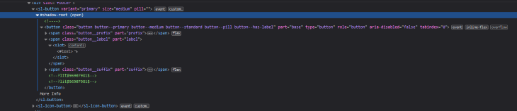
Before we get to styling our component, we need to understand what’s happening here. The <SlButton> component creates a button element with three nested span elements representing each part of the web component: prefix, label, and suffix.
The second span element wraps a <slot> element responsible for rendering whatever content is passed between the web component tags.
Notice the shadow-root; this is our button’s shadow DOM. it encapsulates the content within the button custom element.
The underlying button element is what we need to style. Still, since it’s impossible to do so from the outside with just regular CSS selectors, we’ll use one of the methods Shoelaces provides for styling custom elements.
There are three ways to customize a Shoelace custom element; you can use component parts, design tokens, or custom properties.
The official documentation provides detailed explanations of how to use these methods for customizations. We’ll demonstrate how to customize our components using the first approach (component parts) for convenience.
Shoelace components expose a part attribute that allows you to target custom elements from outside the shadow root using the CSS ::part() pseudo selector.
If you look closely at the <SlButton> custom element in your devtool, you’ll notice a part attribute on the underlying button element:
<button
part="base"
class="button button--primary button--medium button--standard button--pill button--has-label"
type="button"
role="button"
aria-disabled="false"
tabindex="0"
>
...
</button>;
You can target the part(base) attribute on the element by simply giving the <SlButton> component a className and adding the ::part() selector to it in your CSS file:
.button::part(base){
  color: black;
  background-color: green;
}
Alternatively, you can use the component as the selector, but it has to be with the actual custom element, not the React component exported by the wrapper. So, let’s use the sl-button instead of SlButton:
sl-button::part(base){
  color: black;
  background-color: green;
}
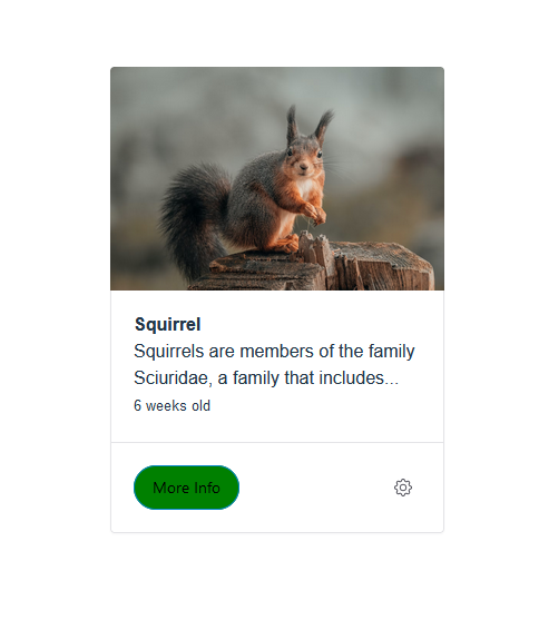
This CSS code will change the button’s text and background color from white to black and blue to green, respectively:
There’s something important to note here. Since every button component has a base part, every button on the page will pick up this style. To fix this quirk, we can again use the component parts approach. We’ll give the button a className and use it instead of the component’s name.
We don’t have much else to style on our card. The default styling is good enough in this case, so we’ll leave it as is.
Next, let’s look at adding event listeners to the More Info button and gear icon.
Shoelace components emit events and methods whose usage may differ slightly from what you’re used to in React. For example, the dialog component has a show method, which manually triggers the pop-up state of the dialog component when called. However, you’ll have to access the underlying custom element using React’s useRef Hook to use this method:
import React from "react";
import { SlDialog } from "@shoelace-style/shoelace/dist/react";

export default function Example() {
  const ref = React.useRef();
  return (
    <div>
      <SlDialog label="dialog" ref={ref}></SlDialog>
    </div>
  );
}
The component also emits an sl-show event that fires when the dialog shows. In React, you can listen to the same event using onSlShow:
import React from "react";
import { SlDialog } from "@shoelace-style/shoelace/dist/react";

export default function Example() {
  const aFunc = () =>{
    console.log("This function will run when the dialog component shows");
  }
  return (
    <div>
      <SlDialog label="dialog" onSlShow={aFunc}></SlDialog>
    </div>
  );
}
Alternatively, you can use React’s event handlers, such as onClick, on components like SlButton and <SlIconButton>:
import React from "react";
import { SlDialog } from "@shoelace-style/shoelace/dist/react";

export default function Example() {
  const [toggle, setToggle] = React.useState(false)
  return (
    <div>
      <SlDialog label="dialog" onClick={() => setToggle(true)}></SlDialog>
    </div>
  );
}
Moving on, we’ll add onClick event handlers that open drawer and dialog components when clicking the More Info button and gear icon components on our card.
The drawer component will display more information about the card’s content. The dialog component will render a switch component that disables or enables the More Info button when its state changes.
The first thing we need to do is create three different states for each event inside the example.jsx file:
 const [open, setOpen] = React.useState(false);
 const [dialog, setDialog] = React.useState(false);
  const [toggle, setToggle] = React.useState(true);
Next, add onClick event handlers to the footer button and gear icon, with a callback function that toggles the Open and Dialog state variable values:
<SlButton
onClick={() => setOpen(true)}
  variant="primary"
  pill
>
  More Info
</SlButton>
<SlIconButton
  name="gear"
  onClick={() => setDialog(true)}
></SlIconButton>
Now, when a button is clicked, its event handlers will set the Open and Dialog state’s value to true.
Next, add drawer and dialog components below the card composition with the following content and props:
<SlDrawer
  label="Squirrel"
  placement="start"
  open={open}
  onSlAfterHide={() => setOpen(false)}
>
  <img
    src="https://images.unsplash.com/photo-1667120651808-34305af680d3?ixlib=rb-4.0.3&ixid=MnwxMjA3fDB8MHxwaG90by1wYWdlfHx8fGVufDB8fHx8&auto=format&fit=crop&w=1736&q=80"
    alt="A squirrel sits on a wood."
   style={{ width: "100%" }}
  />
  <p>
    Squirrels are members of the family Sciuridae, a family that includes
    small or medium-size rodents. The squirrel family includes tree
    squirrels, ground squirrels, and flying squirrels. Squirrels are
    indigenous to the Americas, Eurasia, and Africa, and were introduced
    by humans to Australia.
  </p>

  <SlButton
    slot="footer"
    variant="primary"
    onClick={() => setOpen(false)}
  >
    Close
  </SlButton>
</SlDrawer>
<SlDialog
  label="Dialog"
  open={dialog}
  onSlAfterHide={() => setDialog(false)}
>
  <div
    style={{
      display: "flex",
      alignItems: "center",
      justifyContent: "space-between",
    }}
  >
    <p>Enable/Disable Drawer button</p>
    <SlSwitch
      onSlChange={() => setToggle(toggle ? false : true)}
    ></SlSwitch>
  </div>
  <SlButton
    slot="footer"
    variant="primary"
    onClick={() => setDialog(false)}
  >
    Close
  </SlButton>
</SlDialog>
The open prop on both components lets you pass state variables controlling their open and closed states. We’re using this instead of the show and hide methods.
By passing the Open and Dialog states to the open props, we’re telling the components to show when the values of their respective states are truthy:
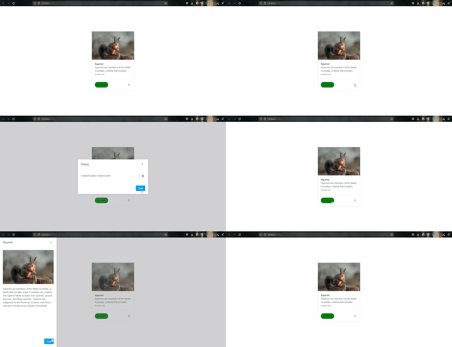
Inside the footer of both components is a button component with an onClick event handler that sets the states to false, thus closing them.
Unlike the rest of the components, the SlSwitch component nested within the dialog component is not using an onClick handler for its event. Instead, we used the onSlChange event handler to set the toggle state.
<SlSwitch
onSlChange={() => setToggle(toggle ? false : true)}
 ></SlSwitch>
Here, we’re checking if the value of the toggle state is true before setting a new value for it.
Right now, the toggle state doesn’t trigger anything. We want it to disable or enable the More Info button based on its current value. So, what we’ll do is add a disabled prop to the button and pass the toggle state variable to it as an argument:
<SlButton
onClick={() => setOpen(true)}
  variant="primary"
  disabled={toggle}
  pill
  className="button"
>
  More Info
</SlButton>
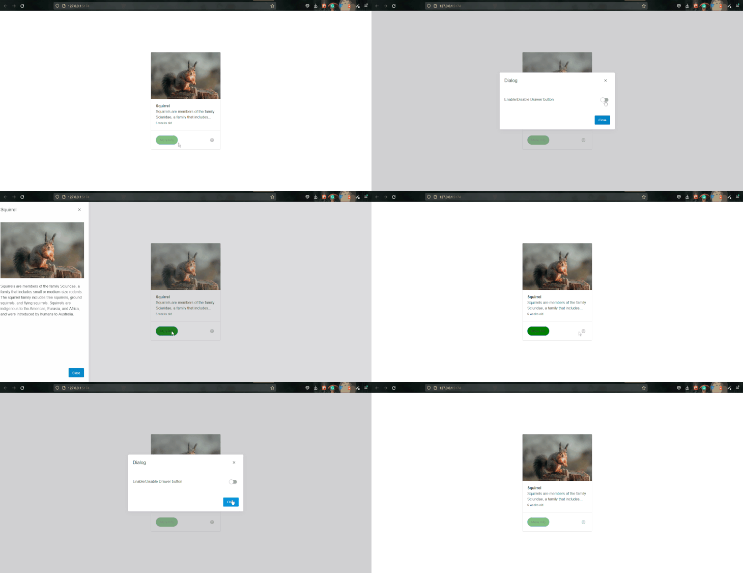
That’s it! We’ve successfully created an interactive card composition with minimal effort. We can easily transfer our composition to other frameworks such as Svelte, Angular, or Vue with little to no tweaking, thanks to Shoelace and the web component technology.
In this article, we introduced Shoelace and web components. We also looked at how Shoelace leverages web component technology to create a framework-agnostic UI library.
The article also showcased Shoelace’s button, card, input, dialog, drawer, and switch components and demonstrated how they can be used together to compose a simple interface.
Install LogRocket via npm or script tag. LogRocket.init() must be called client-side, not
server-side
$ npm i --save logrocket

// Code:

import LogRocket from 'logrocket';
LogRocket.init('app/id');
// Add to your HTML:

<script src="https://cdn.lr-ingest.com/LogRocket.min.js"></script>
<script>window.LogRocket && window.LogRocket.init('app/id');</script>
Can AI refactor legacy CSS without breaking your layout? We benchmarked 5 top AI assistants across cascade order, specificity ties, and stacking traps.
Learn how to offload long-running Gemini AI requests to Trigger.dev background jobs in Next.js using Server Actions and real-time React hooks.
Learn how to use Google’s LiteRT.js to build a browser-based OCR receipt scanner with WebGPU acceleration and on-device LLM structuring via LiteRT-LM.
Learn how to use the TypeScript Compiler API and AST traversal to extract imports and build a file dependency graph CLI.
Hey there, want to help make our blog better?
Join LogRocket’s Content Advisory Board. You’ll help inform the type of content we create and get access to exclusive meetups, social accreditation, and swag.
Sign up now



 Learn more →