Refactoring legacy CSS is notoriously risky. What starts as a quick cleanup of unused selectors, redundant declarations, or specificity hacks can quickly break layout alignment in ways visual regression tests fail to catch. As AI coding assistants become a staple in daily frontend workflows, handing off stylesheet cleanup to LLMs feels like the logical next step.
“Refactor this CSS.”
This is the prompt I gave five AI tools – ChatGPT, Claude, Copilot, Cursor, and Gemini- to see which AI tool refactors CSS best. For the tests, I created a simple product card component with seven specific, deliberately chosen CSS traps, each testing a different way a refactor can go wrong.
In this article, we’ll evaluate how these five AI assistants handle cascade order, specificity ties, stacking contexts, and selector scoping across a pass/fail benchmark, explore seven key findings where AI tools introduce visual or functional regressions, and review an overall ranking to determine which tool you can actually trust with your stylesheets.
I used the five AI tools in their free tiers with the default configurations, since that’s what most people reaching for these tools would use; however, the method and example stylesheet can be reused to test any other AI tool, tier, or model:
| AI tool | Model | Type |
|---|---|---|
| ChatGPT | GPT-5.5 | chat UI |
| Claude | Claude Sonnet 5, Medium | chat UI |
| Copilot | Raptor Mini | coding agent (in VS Code) |
| Cursor | Composer 2.5 Fast | coding agent (standalone editor) |
| Gemini | Gemini 3.5 Flash | chat UI |
All AI tools have access to both the HTML and CSS files.
Here’s the HTML:
<div class="card-wrapper">
  <div class="card">
    <div class="card-image-container">
      <img class="card-img" src="..." alt="Product">
    </div>
    <span class="badge badge-new">New</span>
    <h2 class="card-title">Wireless Headphones Pro</h2>
    <p class="card-description">Premium sound with active noise cancellation and 30-hour battery life.</p>
    <div class="tags-container">
      <span class="tag">Audio</span>
      <span class="tag">Wireless</span>
      <span class="tag">Premium</span>
    </div>
    <div class="card-footer">
      <button class="btn-primary">Add to Cart</button>
    </div>
  </div>
</div>
And here is the CSS:
/* CARD COMPONENT */
.card-wrapper .card {
  background: #fff;
  padding: 20px;
  border: 1px solid #e0e0e0;
  border-radius: 8px;
  width: 320px;
  box-shadow: 0 2px 4px rgba(0, 0, 0, 0.08);
  position: relative;
  z-index: 1;
}

.card-wrapper .card:hover {
  box-shadow: 0 4px 12px rgba(0, 0, 0, 0.14) !important;
  box-shadow: 0 8px 16px rgba(0, 0, 0, 0.18);
  transform: translateY(-2px);
}

/* IMAGE */
.card .card-image-container {
  position: relative;
  z-index: 2;
}

.card .card-image-container img.card-img {
  width: calc(100% + 40px);
  height: 200px;
  object-fit: cover;
  border-radius: 8px 8px 0 0;
  margin: -20px -20px 0;
}

/* BADGE */
.card .badge {
  position: absolute;
  top: 12px;
  left: 12px;
  z-index: 3 !important;
  background-color: #4caf50;
  color: #fff;
  font-size: 11px;
  font-weight: 700;
  padding: 4px 8px;
  border-radius: 999px;
  text-transform: uppercase;
  display: inline-block;
}

.card .badge.badge-new {
  background-color: #43a047;
}

.promo-active .card .badge {
  background-color: #ff9800 !important;
}

/* TITLE */
.card h2.card-title {
  font-size: 18px;
  font-size: 1.125rem;
  font-weight: 700;
  color: #111;
  margin: 8px 0 4px;
  line-height: 1.3;
}

/* BODY TEXT */
.card p {
  color: #666;
  font-size: 14px;
  line-height: 1.5;
  margin-bottom: 12px;
}

.card p.card-description {
  color: #666666 !important;
  font-size: 14px;
  display: -webkit-box;
  -webkit-line-clamp: 2;
  -webkit-box-orient: vertical;
  overflow: hidden;
}

/* TAGS */
.card .tags-container {
  display: flex;
  flex-wrap: wrap;
  gap: 4px;
  margin-bottom: 12px;
}

.card .tags-container .tag {
  background: #f0f0f0;
  color: #333;
  font-size: 12px;
  padding: 2px 8px;
  border-radius: 4px;
}

.card .tags-container .tag:hover {
  background-color: #e0e0e0;
}

/* FOOTER */
.card .card-footer {
  margin-top: 16px;
  padding-top: 16px;
  border-top: 1px solid #e0e0e0;
}

/* BUTTON */
.card .card-footer .btn-primary {
  display: block;
  width: 100%;
  padding: 10px 20px;
  border: none;
  border-radius: 6px;
  background-color: #1a73e8;
  color: #fff;
  font-size: 14px;
  font-weight: 600;
  cursor: pointer;
}

.card .card-footer .btn-primary:hover {
  background-color: #1557b0;
  opacity: 0.95;
}
This is what it looks like when rendered in the browser (on hover, it snaps up slightly and a soft shadow appears around it):

You can find the whole project with the original HTML and CSS files and the five refactored stylesheets in this GitHub repo, and you can check out a live demo here.
Now, let’s see the seven CSS traps:
The .card-wrapper .card:hover rule contains two box-shadow declarations. The first is marked with the !important keyword, so it wins despite appearing earlier in the rule:
.card-wrapper .card:hover {
  box-shadow: 0 4px 12px rgba(0, 0, 0, 0.14) !important;
  box-shadow: 0 8px 16px rgba(0, 0, 0, 0.18);
  /* ... */
}
The ‘NEW’ badge sits over the image’s top-left corner, while .card-image-container establishes its own stacking context via position: relative and z-index: 2.
The badge’s z-index: 3 !important looks like it’s guarding against being overridden by another rule, but, in fact, the !important flag is dead weight; nothing else in this file ever contests z-index on .badge, so removing !important changes nothing here:
.card-wrapper .card {
  /* ... */
  position: relative;
  z-index: 1;
}

.card .card-image-container {
  position: relative;
  z-index: 2;
}

.card .badge {
  position: absolute;
  top: 12px;
  left: 12px;
  z-index: 3 !important;
  /* ... */
}
However, removing the whole z-index declaration from .card .badge is a different story. If we stripped out z-index: 3 entirely, the badge would vanish behind the image.
The .badge and .badge-new selectors have similar-looking but different green values (#4caf50 vs #43a047), which are Material Design’s adjacent “Green 500” and “Green 600” shades. A tool that assumes these are accidental duplicates and merges them introduces a real, if subtle, change:
.card .badge {
  /* ... */
  background-color: #4caf50;
  /* ... */
}

.card .badge.badge-new {
  background-color: #43a047;
}
The .promo-active .card .badge selector changes the color of the badge from green to orange. It only applies when another part of the application adds the .promo-active class at runtime. Since nothing in the default demo exercises this rule, it’s easy to dismiss as dead code:
.promo-active .card .badge {
  background-color: #ff9800 !important;
}
The !important here isn’t dead weight the way Test 2’s was because .promo-active .card .badge and .card .badge.badge-new are tied on specificity (three classes each), as shown by Keegan Street’s Specificity Calculator:
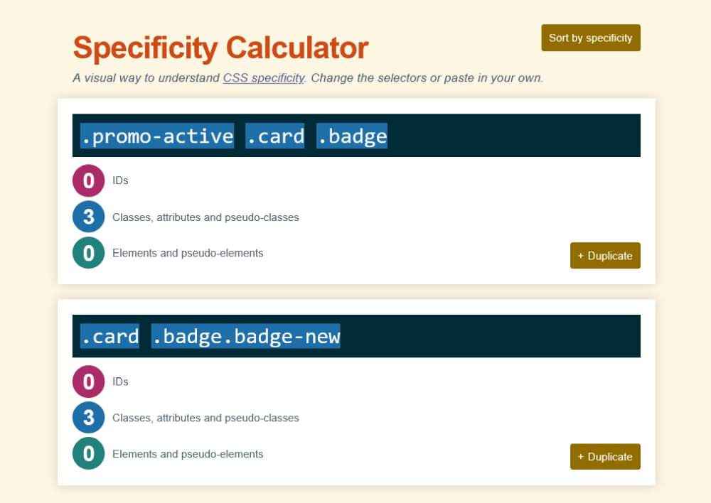
Because of this, it’s the !important flag, and not specificity, that guarantees the promo color wins. If a tool removes the flag while the tie holds, source order decides instead. Here, that means the promo badge stays green.
The .card p.card-description selector repeats color and font-size from the generic .card p rule, which is genuinely redundant. On the other hand, it also contains the necessary declarations for two-line text truncation, which shouldn’t be cleaned up:
.card p {
  color: #666;
  font-size: 14px;
}

.card p.card-description {
  color: #666666 !important;
  font-size: 14px;
  display: -webkit-box;
  -webkit-line-clamp: 2;
  -webkit-box-orient: vertical;
  overflow: hidden;
}
Several selectors are intentionally scoped beneath the .card class (e.g., .card .card-footer .btn-primary, .card .tags-container .tag, .card .badge, etc.).
Flattening them works perfectly in this isolated demo, but these selector names (e.g., .btn-primary and .tag) are generic enough that in a real, larger codebase they could collide with unrelated global styles once unscoped:
.card .badge {
  /* ... */
}

.card .tags-container {
  /* ... */
}

/* ... */

.card .card-footer .btn-primary {
  /* ... */
}
As mentioned in Test 5 above, .card-description truncates to two lines using a decade-old, non-standard hack that looks exactly like something an eager cleanup pass would “modernize” away:
.card p.card-description {
  /* ... */
  display: -webkit-box;
  -webkit-line-clamp: 2;
  -webkit-box-orient: vertical;
  overflow: hidden;
}
This code shouldn’t be modernized. If a tool swaps it for the newer, unprefixed line-clamp property instead of leaving it alone, the truncation breaks because most browsers still only support the -webkit- prefixed version.
For lack of space, I won’t copy the five refactored stylesheets here; you can find them in the GitHub repo.
However, here is a pass/fail matrix of how ChatGPT, Claude, Copilot, Cursor, and Gemini did on the seven refactoring tests:
| Test | ChatGPT | Claude | Copilot | Cursor | Gemini |
|---|---|---|---|---|---|
| 1. Hover cascade | ❌ | ❌ | ❌ | ❌ | ❌ |
| 2. Stacking context | ⚠️ (#1) | ⚠️ (#2) | ⚠️ (#1) | ✅ | ⚠️ (#1) |
| 3. Near-duplicate values | ✅ | ❌ | ✅ | ✅ | ❌ |
| 4. State override | ✅ (#3) | ✅ (#3) | ✅ (#3) | ✅ (#3) | ✅ (#3) |
| 5. Partial cleanup | ❌ | ✅ | ✅ | ✅ | ❌ |
| 6. Selector scope | ⚠️ | ⚠️ | ⚠️ | ⚠️ (#4) | ⚠️ |
| 7. Vendor prefixes | ✅ | ✅ | ✅ | ✅ | ✅ |
✅ – Passed
❌ – Regression (rendered behavior demonstrably changed)
⚠️ – Works today, but only because of specifics of this file — a real risk in a larger codebase
(#1) ChatGPT, Copilot, and Gemini all dropped z-index: 1 from .card itself, keeping only position: relative, which alone doesn’t create a stacking context. Safe today only because nothing else on the page uses z-index. See Finding II. below.
(#2) Claude’s refactor carried two separate risks: it dropped .card‘s own z-index like the three AI tools in Footnote #1, and its badge-vs-image fix relied on markup order rather than an explicit value. See Finding II. below.
(#3) All five tools passed, but most likely by coincidence, not because they recognized the tie in the original selectors. See Finding V. below.
(#4) Cursor is the only tool that preserved any scoping at all on Test 6 (the badge family and the top-level .card rule). I still marked it ⚠️ because it flattened .btn-primary and .tag exactly like the other four tools. See Finding III. below.
The findings below aren’t organized one-per-test. While some of them group several tests together, others aren’t tied to any specific test at all. They include my observations during and after reviewing the refactored code.
To avoid confusion with the seven tests above (Test 1 – Test 7), they’re numbered with Roman numerals.
All five AI tools removed the duplicate font-size fallback on the title:
--- original/style.css
+++ (all five outputs, identical here)
  .card-title {
-   font-size: 18px;
    font-size: 1.125rem;
    font-weight: 700;
    ...
  }
They also removed the redundant !important on .card-description‘s color, which was already covered by the plain .card p rule one level up.
Neither is one of the seven designed traps, so there’s no real judgment call available here, just code that’s unambiguously safe to delete. That’s the floor, not a differentiator; every tool cleared it without incident.
There’s a good chance the cascade is the hardest concept to understand about CSS. AI tools still got confused by it even in this super simple, single-file CSS demo.
Issues with the cascade showed up in two tests: Test 1’s shadow conflict and Test 2’s stacking-context fragility. Both come down to the same underlying skill: correctly reasoning about which rule the browser actually applies, rather than which one looks intended.
Since !important beats a normal declaration regardless of source order, it’s the first box shadow that renders in the original CSS, not the second one:
--- original/style.css
+++ (all five outputs, identical here)
  .card:hover {
-   box-shadow: 0 4px 12px rgba(0, 0, 0, 0.14) !important;  /* this one wins in the original */
-   box-shadow: 0 8px 16px rgba(0, 0, 0, 0.18);              /* never applies in the original */
+   box-shadow: 0 8px 16px rgba(0, 0, 0, 0.18);              /* every tool kept the losing value */
    transform: translateY(-2px);
  }
However, Claude, Copilot, Cursor, ChatGPT, and Gemini all kept the value that never actually applied in the source file. This is a genuine regression, not a stylistic difference. The hover shadow changes from a tight 4px/12px blur to a noticeably larger, softer one.
Four of the five tools also added something the original never had: a transition on .card, turning the hover state from an instant snap into a smooth animation. Only Claude left it untouched. Whether that counts as a regression depends on what we mean by “refactor”. The added transition doesn’t misrepresent anything in the original file, unlike the shadow value above, but it’s still an unrequested change.
None of the five AI tools visually broke the badge-over-image rendering, but two arrived there very differently. Compare Gemini and Claude’s refactoring on the exact same rule:
--- original/style.css
+++ refactors/gemini.css
  .card-image-container {
-   position: relative;
-   z-index: 2;
  }
--- original/style.css
+++ refactors/claude.css
  .card-image-container {
    position: relative;
-   z-index: 2;
  }
Gemini removed both position and z-index, making the element fully static, which guarantees it paints in an earlier phase than the still-positioned badge, so the ordering is structurally safe regardless of what else changes around it.
Claude, on the other hand, removed only z-index and left position: relative behind, so .card-image-container and the badge now both have z-index: auto, landing them in the same paint phase. This means that their visibility is decided purely by which one comes first in the HTML, with nothing in the CSS pinning that down. Swap the two in the markup, CSS untouched, and the badge disappears behind the image:
<!-- Today: badge paints on top -->
<div class="card-image-container">...</div>
<span class="badge badge-new">New</span>

<!-- CSS unchanged, markup order swapped: badge is now hidden -->
<span class="badge badge-new">New</span>
<div class="card-image-container">...</div>
While a direct swap like this is an unlikely edit in a real-world codebase, a more realistic version of this risk is a third element landing between them later (e.g., a wishlist icon or a second badge) without its own explicit z-index, which would shuffle the stacking unpredictably.
ChatGPT, Cursor, and Copilot kept explicit z-index values for the badge and image-container — but it was only Cursor that also kept z-index: 1 on .card itself. Without it, position: relative alone doesn’t create a stacking context, so ChatGPT, Claude, Copilot, and Gemini all lose the isolation that keeps the product card’s z-index values from ever needing to compete with anything outside it. Invisible today, since nothing else on the page uses z-index, but it becomes real in the moment when the card sits near any other positioned, z-indexed element.
I expected Test 6 to split the field. It didn’t, but that’s a more interesting finding. Every AI tool flattened the selectors the test was designed to catch, for example:
--- original/style.css
+++ (all five outputs, identical here)
- .card .card-footer .btn-primary {
+ .btn-primary {
    display: block;
    width: 100%;
    ...
  }
.tag, .card-title, .card-footer, .card-image-container, and .card-img all got the same treatment from all five tools. In an isolated demo that’s invisible; in a real codebase, .btn-primary and .tag are exactly the kind of generic names likely to already exist in a global stylesheet, and flattening them out of .card‘s scope is a real risk, not a hypothetical one.
The one partial exception is Cursor, which kept the badge family scoped where everyone else flattened it:
--- original/style.css
+++ (ChatGPT/Gemini/Claude/Copilot — all four flattened this selector; Cursor did not)
- .card .badge {
+ .badge {
    ...
  }
It seems Cursor is more cautious than the other four tools, but it’s still not cautious across the board since it preserved the badge family and the top-level .card rule but flattened the rest exactly like the other tools.
Some of the AI tools made assumptions they shouldn’t have. Test 3 caught Claude and Gemini in the act, while Test 5 exposed ChatGPT and Gemini.
.badge (#4caf50) and .badge-new (#43a047) are intentionally different shades. Gemini and Claude both merged them into a single value:
--- original/style.css
+++ refactors/gemini.css and refactors/claude.css
  .badge {
-   background-color: #4caf50;
+   background-color: #43a047;  /* .badge-new's color, now used for both */
  }
- .badge-new { background-color: #43a047; }
This is a regression, just a subtle and latent one. As mentioned above, the two greens are Material Design’s adjacent “Green 500” and “Green 600” shades, close enough that the visual difference is barely perceptible on its own. However, both Gemini and Claude moved .badge-new‘s color up into the base .badge rule and deleted .badge-new entirely, so what used to be two independently adjustable colors is now just one. Change that shade today, and every badge changes with it, whether or not it’s marked .badge-new.
ChatGPT, Cursor, and Copilot kept the two values separate.
ChatGPT and Gemini made a similar false assumption, but the other way around. Instead of promoting a specific rule’s value into the general one like in the previous case, they folded the general rule into the specific one, deleting .card p and merging its styling directly into .card-description:
--- original/style.css
+++ refactors/chatgpt.css and refactors/gemini.css
- .card p {
-   margin-bottom: 12px;
-   color: #666;
-   font-size: 14px;
-   line-height: 1.5;
- }
  .card-description {
+   color: #666;
+   font-size: 14px;
+   line-height: 1.5;
+   margin-bottom: 12px;
    display: -webkit-box;
    -webkit-line-clamp: 2;
    -webkit-box-orient: vertical;
    overflow: hidden;
  }
Cursor, Claude, and Copilot all kept the two rules separate, preserving the original’s actual intent.
There were just two tests every AI tool passed: Test 4 and Test 7. However, in the case of Test 4, this happened with a disclaimer.
ChatGPT, Claude, Copilot, Cursor, and Gemini all removed the !important flag from .promo-active .card .badge, and nothing broke as a result, though nothing in any tool’s output suggests that was intentional, rather than a side effect of flattening everything uniformly. In the original file, .promo-active .card .badge and .card .badge.badge-new are tied on specificity (i.e., three classes each), with !important being the only thing guaranteeing the promo color wins.
What saved every tool is that none of them left the tie intact. ChatGPT, for instance, flattened .badge.badge-new down to a lone .badge-new, dropping it from two classes to one, while .promo-active .badge keeps two. That’s no longer a tie; .promo-active .badge now wins outright, 2 to 1, regardless of file order. The other four tools each did some version of the same thing.
Unlike Test 4, Test 7 was a clean pass. All the tools left .card-description‘s -webkit-box / -webkit-line-clamp / -webkit-box-orient combination completely untouched, and none offered a newer unprefixed alternative either. This is the one part of the CSS file every AI tool treated as off-limits rather than something to modernize.
Three tools — Cursor, Claude, and Copilot — introduced CSS custom properties unprompted. Used well, this is a genuine upgrade. For example, the original CSS hardcodes -20px in two separate places for the image’s edge-to-edge bleed, quietly tied to the card’s 20px padding. Cursor and Claude both caught this and tied the two together:
--- original/style.css
+++ refactors/cursor.css and refactors/claude.css
  .card-img {
-   width: calc(100% + 40px);
+   width: calc(100% + var(--card-padding) * 2);
    height: 200px;
-   margin: -20px -20px 0;
+   margin: calc(var(--card-padding) * -1) calc(var(--card-padding) * -1) 0;
  }
Copilot defined an equivalent --spacing variable elsewhere in the same file, then didn’t use it here. This is, however, an inconsistency, not a regression, since the hardcoded values still match the original exactly. It just means Copilot’s token system didn’t actually deliver the single-source-of-truth benefit it was implicitly promising.
Beyond that, Copilot also added a rule that didn’t exist anywhere in the source:
--- original/style.css
+++ refactors/copilot.css
+ .card-wrapper {
+   display: flex;
+   justify-content: center;
+   padding: calc(var(--spacing) * 1.5);
+ }
This does count as a regression from the original’s rendered output because the card goes from left-aligned by default to centered on the page, a layout change nobody asked for. It reads less like a refactor and more like a small unrequested redesign.
None of the seven test cases were built to catch this regression. I found it by testing the five demos in a browser, not by reading the CSS. The “Add to Cart” button felt subtly different on hover in three of them, and I couldn’t immediately say why until I went back to the source. The original button hover state is:
.btn-primary:hover {
  background-color: #1557b0;
  opacity: 0.95;
}
ChatGPT, Gemini, and Claude dropped the opacity line entirely:
--- original/style.css
+++ refactors/chatgpt.css, refactors/gemini.css, refactors/claude.css
  .btn-primary:hover {
    background-color: #1557b0;
-   opacity: 0.95;
  }
Only Cursor and Copilot kept it. It’s a single, easy-to-miss property, but losing it means one less bit of feedback when a user actually hovers over the button.
Here’s a straight ranking, scored directly from the results above. Each test counts for 2 points (✅), 1 (⚠️), or 0 (❌) — except Claude’s Test 2, split to 0.5 to reflect two compounded risks rather than one (see the footnote below).
I also added the three findings outside the test suite (Finding I., Finding VI., and Finding VII.), capped at 1 point each, so no single finding can outweigh an actual test result:
| Cursor | Copilot | ChatGPT | Claude | Gemini | |
|---|---|---|---|---|---|
| Test 1 – Hover cascade | 0 | 0 | 0 | 0 | 0 |
| Test 2 – Stacking context | 2 | 1 | 1 | 0.5 | 1 |
| Test 3 – Near-duplicate values | 2 | 2 | 2 | 0 | 0 |
| Test 4 – State override | 2 | 2 | 2 | 2 | 2 |
| Test 5 – Partial cleanup | 2 | 2 | 0 | 2 | 0 |
| Test 6 – Selector scope | 1 | 1 | 1 | 1 | 1 |
| Test 7 – Vendor prefixes | 2 | 2 | 2 | 2 | 2 |
| SEVEN-TEST SUBTOTAL | 11 | 10 | 8 | 7.5 | 6 |
| Finding I. – Redundancy | 1 | 1 | 1 | 1 | 1 |
| Finding VI. – Modernization (#1) | 1 | 0 | 0.5 | 1 | 0.5 |
| Finding VII. – Hover opacity | 1 | 1 | 0 | 0 | 0 |
| TOTAL | 14 | 12 | 9.5 | 9.5 | 7.5 |
(#1) Cursor and Claude earned full points (1.0) by introducing custom properties to fix the padding-coupling issue. Copilot scored 0 after adding an unused variable and introducing an unrequested .card-wrapper centering regression. ChatGPT and Gemini received 0.5 as a neutral score for leaving custom properties untouched, since opting not to modernize isn’t the same as modernizing poorly. See Finding VI above for details.
As the scoring table shows, Cursor finished in first place. It was the only tool that avoided unique regressions, failing only Test 1 alongside every other assistant, and one of just two tools that preserved the hover opacity declaration (Finding VII).
Copilot trailed Cursor by two points, losing .card‘s stacking isolation like ChatGPT and Gemini (Test 2) and stumbling on its custom property implementation (Finding VI).
ChatGPT and Claude tied overall, though they took different paths to get there. ChatGPT performed slightly better on the seven core test cases (8 vs. 7.5), but Claude’s effective use of custom properties in Finding VI leveled the final score.
Gemini landed in last place, standing out as the only assistant to fail three of the seven test cases (Test 1, Test 3, and Test 5).
One clear pattern emerged: the top two spots went to agentic, editor-based coding assistants rather than chat interfaces. That distinction makes sense. Agentic tools edit files directly in place, whereas chat tools regenerate the entire stylesheet from a prompt – a process where it’s much easier to accidentally alter or drop existing properties.
However, the main takeaway isn’t the ranking itself. It’s the fact that every single AI tool introduced a bug on a component simple enough to fit inside a single CSS file.
AI assistants excel at standard cleanup tasks like removing dead code and deleting redundant declarations. Yet several went beyond their scope; most added an unrequested transition, and Copilot centered a card layout that was never meant to move. While AI can speed up a CSS refactor, developers still need to review the output, spot visual regressions, evaluate unrequested changes, and ensure the CSS cascade continues to resolve as intended.
Ultimately, these seven test cases offer a practical, reusable benchmark. Because the prompt and input stylesheet remain fixed, this test suite can easily evaluate future model releases or new AI coding assistants, giving us a consistent way to measure progress over time.
As web frontends get increasingly complex, resource-greedy features demand more and more from the browser. If you’re interested in monitoring and tracking client-side CPU usage, memory usage, and more for all of your users in production, try LogRocket.
LogRocket lets you replay user sessions, eliminating guesswork around why bugs happen by showing exactly what users experienced. It captures console logs, errors, network requests, and pixel-perfect DOM recordings — compatible with all frameworks.
LogRocket's Galileo AI watches sessions for you, instantly identifying and explaining user struggles with automated monitoring of your entire product experience.
Modernize how you debug web and mobile apps — start monitoring for free.

Learn how to offload long-running Gemini AI requests to Trigger.dev background jobs in Next.js using Server Actions and real-time React hooks.

Learn how to use Google’s LiteRT.js to build a browser-based OCR receipt scanner with WebGPU acceleration and on-device LLM structuring via LiteRT-LM.
Learn how to use the TypeScript Compiler API and AST traversal to extract imports and build a file dependency graph CLI.

Stop generating AI slop with Claude Code. Discover 5 actionable developer tips to manage context windows, enforce rules with hooks, and improve code quality.
Would you be interested in joining LogRocket's developer community?
Join LogRocket’s Content Advisory Board. You’ll help inform the type of content we create and get access to exclusive meetups, social accreditation, and swag.
Sign up now



 Learn more →