Editor’s note: This post was updated on 8 March 2022 to correct any outdated information and add the How do you use flexWrap in React Native? and Using flexbox’s gap in React Native sections.
If you have a web design or development background, you may be familiar with flexbox. It’s an opt-in CSS tool that enables you to build layouts based on columns and rows.
In React Native, this is the default way to build layouts. It works wonderfully for mobile development because it allows us to build layouts that fit multiple screen sizes, thanks to responsive design.
Flexbox is the default in React Native, but we don’t have to opt in to it, meaning we don’t need to set display: flex in a style:
const styles = StyleSheet.create({
  card: {
    display: 'flex' // this is unnecessary
  }
});
There are also different defaults that make flexbox more conducive to mobile development:
| Property | Web Default | React Native Default |
|---|---|---|
flexDirection |
row |
column |
alignContent |
stretch |
flex-start |
flexShrink |
1 |
0 |
There are a few flexbox properties you’ll use regularly that are worth remembering. Here’s a run down on them and what they do.
flexflex defines how much of a view will fill the screen. Available values are integers greater than or equal to 0.
flexDirectionflexDirection determines in which direction—vertically or horizontally—the children are laid out. Available values include column, row, column-reverse, and row-reverse.
justifyContentjustifyContent determines how an item should render along the primary axis (determined by the flexDirection property). Available values are flex-start, flex-end, center, space-between, space-around, and space-evenly.
alignItemsalignItems determines how an item should be rendered along the secondary axis (determined by the flexDirection property). Available values are flex-start, flex-end, center, and baseline.
alignSelfalignSelf determines how a child should align itself and overrides alignItems. Available values are flex-start, flex-end, center, and baseline
flexWrapflexWrap determines what happens when the children of a container overflow outside the container. By default, they are forced to fit into a single line, which consequently shrinks them.
When the flexWrap property is set to wrap, children of the container can spill over into multiple lines.
You can learn more about layouts in flexbox in the official docs. Now, let’s dive into what each property does and how to use it.
flex property in React Native?The flex property determines how the view fills the screen. To illustrate, let’s take a look at two examples with very similar code.
Notice that the available values include integers greater than or equal to 0:
import React from "react";
import { StyleSheet, View } from "react-native";

export default function App() {
  return (
    <>
      <View style={{ backgroundColor: "#7cb48f", flex: 1 }} />
    </>
  );
}
Here’s the result:
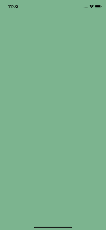
In this case, the view will take up the entire screen. Why? Because it has a property of flex: 1, and the space is split into one group; it will take up 100 percent of the screen.
Let’s look at a second example using the following code:
import React from "react";
import { StyleSheet, View } from "react-native";

export default function App() {
  return (
    <>
      <View style={{ backgroundColor: "#7cb48f", flex: 1 }} />
      <View style={{ backgroundColor: "#7CA1B4", flex: 3 }} />
    </>
  );
}
Here’s the outcome:
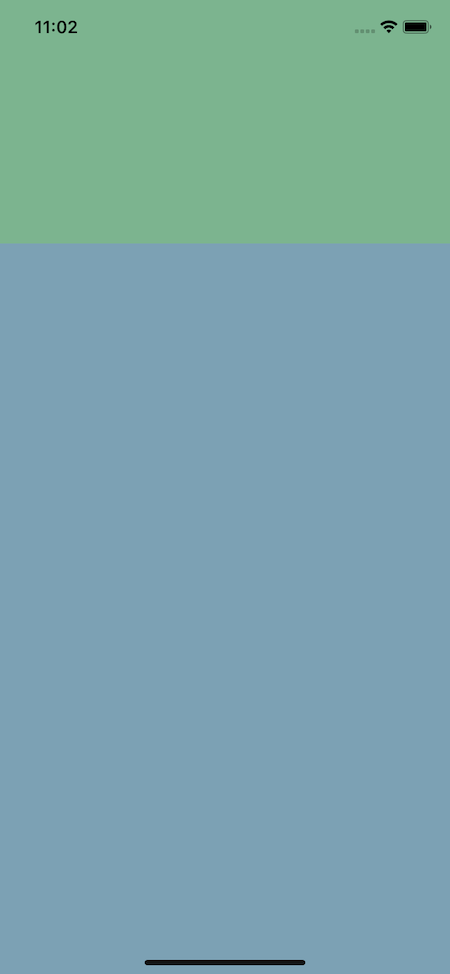
Alternatively, we can see that the green area now takes up just one-quarter of the screen despite having the same flex value.
That’s because the screen is now split into four blocks (1+3), so the flex property is the fraction of the screen it should take up.
flexDirection in React NativeFlexDirection determines the direction children should render. You can code with the column, row, column-reverse, and row-reverse values, but the default is column:
import React from "react";
import { StyleSheet, View } from "react-native";

export default function App() {
  return (
    <>
      <View style={styles.container}>
        <View style={styles.square} />
        <View style={styles.square} />
        <View style={styles.square} />
      </View>
    </>
  );
}

const styles = StyleSheet.create({
  container: {
    backgroundColor: "#7CA1B4",
    flex: 1,
    alignItems: "center", // ignore this - we'll come back to it
    justifyContent: "center", // ignore this - we'll come back to it
    flexDirection: "column"
  },
  square: {
    backgroundColor: "#7cb48f",
    width: 100,
    height: 100,
    margin: 4,
  },
});
This then renders to the following:
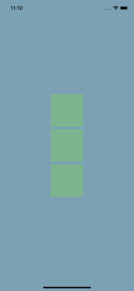
Now, let’s change the direction from a column to a row using flexDirection of row:
import React from "react";
import { StyleSheet, View } from "react-native";

export default function App() {
  return (
    <>
      <View style={styles.container}>
        <View style={styles.square} />
        <View style={styles.square} />
        <View style={styles.square} />
      </View>
    </>
  );
}

const styles = StyleSheet.create({
  container: {
    backgroundColor: "#7CA1B4",
    flex: 1,
    alignItems: "center", // ignore this - we'll come back to it
    justifyContent: "center", // ignore this - we'll come back to it
    flexDirection: "row",
  },
  square: {
    backgroundColor: "#7cb48f",
    width: 100,
    height: 100,
    margin: 4,
  },
});
Here’s the output:
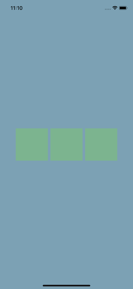
Note that using *-reverse just reverses the order they’re rendered in.
justifyContent property in React NativejustifyContent determines content along the primary axis that is affected by the flexDirection. If flexDirection is classified as column, then it’s vertical. If it’s classified as row, it’s horizontal.
As a reminder, here are the available values: flex-start, flex-end, center, space-between, space-around, and space-evenly.
Below we’ve set justifyContent to center. Because the primary axis is a column, that means we’ll center the content vertically:
import React from "react";
import { StyleSheet, View } from "react-native";

export default function App() {
  return (
    <>
      <View style={styles.container}>
        <View style={styles.square} />
        <View style={styles.square} />
        <View style={styles.square} />
      </View>
    </>
  );
}

const styles = StyleSheet.create({
  container: {
    backgroundColor: "#7CA1B4",
    flex: 1,
    justifyContent: "center",
  },
  square: {
    backgroundColor: "#7cb48f",
    width: 100,
    height: 100,
    margin: 4,
  },
});
This code then outputs the following:
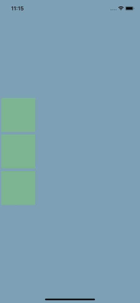
Next, let’s use the space-around property. This will cause the layout to split the elements along the primary (vertical) axis evenly, meaning there will be an equal amount of distance from the top and bottom of the screen as there is between each element:
import React from "react";
import { StyleSheet, View } from "react-native";

export default function App() {
  return (
    <>
      <View style={styles.container}>
        <View style={styles.square} />
        <View style={styles.square} />
        <View style={styles.square} />
      </View>
    </>
  );
}

const styles = StyleSheet.create({
  container: {
    backgroundColor: "#7CA1B4",
    flex: 1,
    justifyContent: "space-around",
  },
  square: {
    backgroundColor: "#7cb48f",
    width: 100,
    height: 100,
    margin: 4,
  },
});
This code then outputs the following:
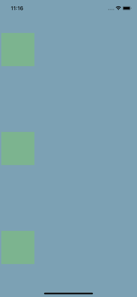
Each of these properties allows us to create a unique layout.
flex-start aligns the items at the top of the screen, flex-end aligns the items at the bottom, and space-between maximizes the distance between items (that is, the first box is at the top of the screen, the third box at the bottom, and the second box is centered).
alignItems in React NativealignItems determines how an item should render along the secondary axis, which is determined by the flexDirection property.
This is the inverse of justifyContent. So, if justifyContent handles the vertical alignment, then alignItems handles the horizontal alignment.
The available values here are flex-start, flex-end, center, and baseline.
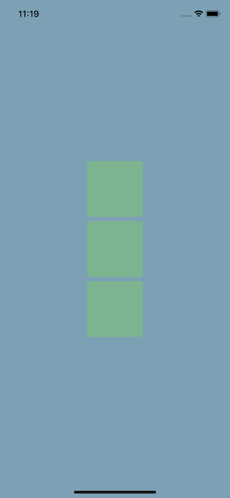
Below, we see how alignItems can center the content horizontally when using the default flexDirection (column):
import React from "react";
import { StyleSheet, View } from "react-native";

export default function App() {
  return (
    <>
      <View style={styles.container}>
        <View style={styles.square} />
        <View style={styles.square} />
        <View style={styles.square} />
      </View>
    </>
  );
}

const styles = StyleSheet.create({
  container: {
    backgroundColor: "#7CA1B4",
    flex: 1,
    justifyContent: "center",
    alignItems: "center",
  },
  square: {
    backgroundColor: "#7cb48f",
    width: 100,
    height: 100,
    margin: 4,
  },
});
Here’s the output:
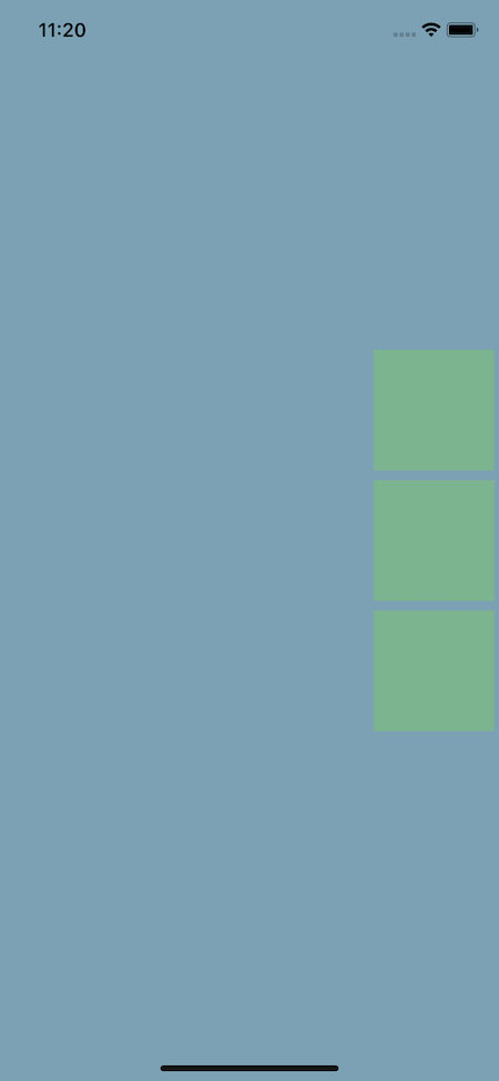
Likewise, when setting the alignItems to flex-end, we see that the elements move to the end of the flex area at the far right:
import React from "react";
import { StyleSheet, View } from "react-native";

export default function App() {
  return (
    <>
      <View style={styles.container}>
        <View style={styles.square} />
        <View style={styles.square} />
        <View style={styles.square} />
      </View>
    </>
  );
}

const styles = StyleSheet.create({
  container: {
    backgroundColor: "#7CA1B4",
    flex: 1,
    justifyContent: "center",
    alignItems: "flex-end",
  },
  square: {
    backgroundColor: "#7cb48f",
    width: 100,
    height: 100,
    margin: 4,
  },
});
Here’s the updated output:
alignSelf in React NativealignSelf determines how a child should align itself and overrides alignItems. The available values for alignSelf are flex-start, flex-end, center, and baseline.
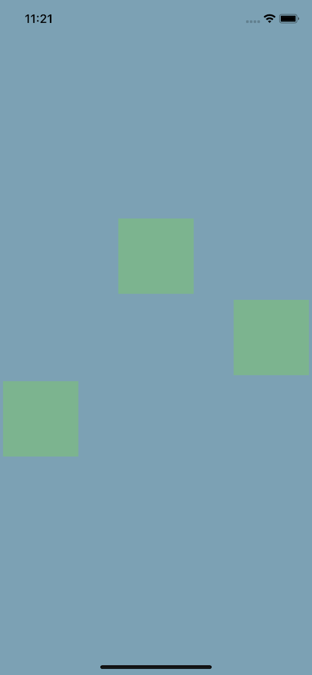
Below, we set a default alignItems property and override it using alignSelf:
import React from "react";
import { StyleSheet, View } from "react-native";

export default function App() {
  return (
    <>
      <View style={styles.container}>
        <View style={styles.square} />
        <View style={[styles.square, { alignSelf: "flex-end" }]} />
        <View style={[styles.square, { alignSelf: "flex-start" }]} />
      </View>
    </>
  );
}

const styles = StyleSheet.create({
  container: {
    backgroundColor: "#7CA1B4",
    flex: 1,
    justifyContent: "center",
    alignItems: "center",
  },
  square: {
    backgroundColor: "#7cb48f",
    width: 100,
    height: 100,
    margin: 4,
  },
});
Here’s what it looks like:
flexWrap in React Native?When the children of a container overflow out of it, flexWrap determines whether they should be shrunk on a single line or wrapped into multiple lines. The available values for flexWrap are nowrap and wrap.
Below, we set a container’s flexWrap property to wrap to wrap the boxes inside it into multiple lines:
import React, { useState } from "react";
import { StyleSheet, View } from "react-native";

export default function App() {
  return (
    <>
      <View style={styles.container}>
        <View style={styles.square} />
        <View style={styles.square} />
        <View style={styles.square} />
        <View style={styles.square} />
        <View style={styles.square} />
        <View style={styles.square} />
        <View style={styles.square} />
      </View>
    </>
  );
}

const styles = StyleSheet.create({
  container: {
    backgroundColor: "#7CA1B4",
    flex: 1,
    flexDirection:'row',
    flexWrap: "wrap",
  },
  square: {
    backgroundColor: "#7cb48f",
    width: 100,
    height: 100,
    margin: 4,
  },
});
Here’s the result:
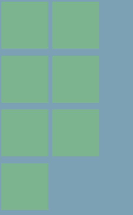
If you comment out the flexWrap style, all the boxes will appear on the same line.
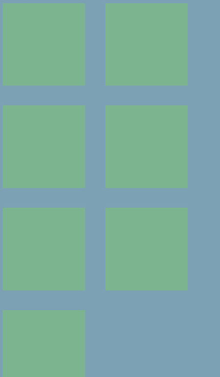
gap in React NativeWe can use the gap property to add gaps between the grid items that we created above. Its value should be the size of the gap between the items.
Below, let’s set the container’s gap property to 1rem to add spacing of 1rem between items horizontally and vertically:
import React, { useState } from "react";
import { StyleSheet, View } from "react-native";

export default function App() {
  return (
    <>
      <View style={styles.container}>
        <View style={styles.square} />
        <View style={styles.square} />
        <View style={styles.square} />
        <View style={styles.square} />
        <View style={styles.square} />
        <View style={styles.square} />
        <View style={styles.square} />
      </View>
    </>
  );
}

const styles = StyleSheet.create({
  container: {
    backgroundColor: "#7CA1B4",
    flex: 1,
    flexDirection:'row',
    gap: '1rem',
    flexWrap: "wrap",
  },
  square: {
    backgroundColor: "#7cb48f",
    width: 100,
    height: 100,
    margin: 4,
  },

});
Notice how the spaces between the items are much bigger now:
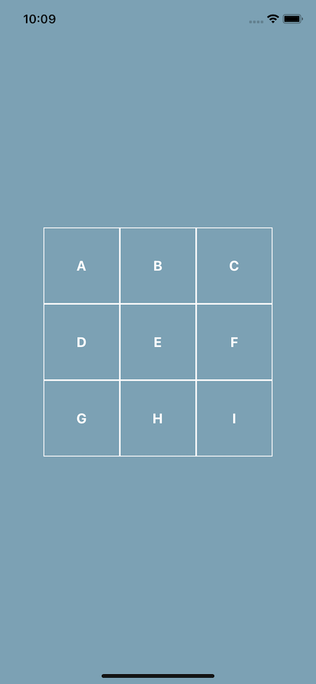
Now that we know what each property in flexbox does, let’s create a grid using flexbox. Our end goal is what you see in the next image:
Feel free to take the starter code and try it yourself before following along:
// starter.js

import React from "react";
import { StyleSheet, View, Text } from "react-native";

export default function App() {
  return <View style={styles.container}></View>;
}

const styles = StyleSheet.create({
  container: {
    flex: 1,
    backgroundColor: "#7CA1B4",
    alignItems: "center",
    justifyContent: "center",
  },
});
Looking at the example image, we can break it down so we have three rows each with its own three columns. Each square should render its text vertically and horizontally.
Next, let’s create a Square component to save on some repetition:
import React from "react";
import { StyleSheet, View, Text } from "react-native";

const Square = ({ text }) => (
  <View style={styles.square}>
    <Text style={styles.text}>{text}</Text>
  </View>
);

export default function App() {
  return (
    <View style={styles.container}>
      <View style={styles.row}>
        <Square text="A" />
        <Square text="B" />
        <Square text="C" />
      </View>
      <View style={styles.row}>
        <Square text="D" />
        <Square text="E" />
        <Square text="F" />
      </View>
      <View style={styles.row}>
        <Square text="G" />
        <Square text="H" />
        <Square text="I" />
      </View>
    </View>
  );
}
Here’s what you should see so far:
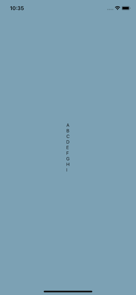
Here, we added a few style properties, namely styles.row and styles.square.
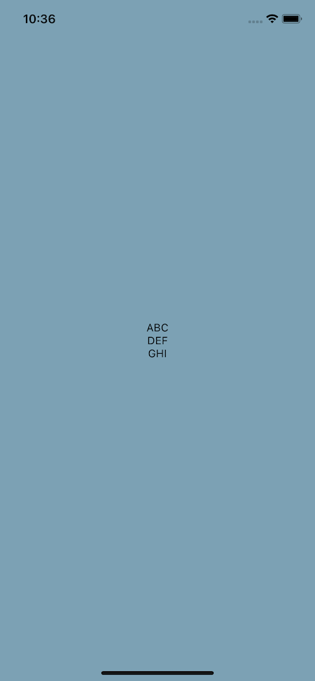
We know row should render its items in a row, so let’s set its flexDirection: 'row':
const styles = StyleSheet.create({
  container: {
    flex: 1,
    backgroundColor: "#7CA1B4",
    alignItems: "center",
    justifyContent: "center",
  },
  row: {
    flexDirection: "row",
  },
});
Here’s the updated output:
Next, let’s create the square itself with the appropriate border, height, width, and text color. We can then use justifyContent and alignItems on that square to vertically and horizontally center the text within it:
const styles = StyleSheet.create({
  container: {
    flex: 1,
    backgroundColor: "#7CA1B4",
    alignItems: "center",
    justifyContent: "center",
  },
  row: {
    flexDirection: "row",
  },
  square: {
    borderColor: "#fff",
    borderWidth: 1,
    width: 100,
    height: 100,
    justifyContent: "center",
    alignItems: "center",
  },
  text: {
    color: "#fff",
    fontSize: 18,
    fontWeight: "bold",
  },
});
You should now see the desired result:
This leaves us with the final code:
// finished.js

import React from "react";
import { StyleSheet, View, Text } from "react-native";

const Square = ({ text }) => (
  <View style={styles.square}>
    <Text style={styles.text}>{text}</Text>
  </View>
);

export default function App() {
  return (
    <View style={styles.container}>
      <View style={styles.row}>
        <Square text="A" />
        <Square text="B" />
        <Square text="C" />
      </View>
      <View style={styles.row}>
        <Square text="D" />
        <Square text="E" />
        <Square text="F" />
      </View>
      <View style={styles.row}>
        <Square text="G" />
        <Square text="H" />
        <Square text="I" />
      </View>
    </View>
  );
}

const styles = StyleSheet.create({
  container: {
    flex: 1,
    backgroundColor: "#7CA1B4",
    alignItems: "center",
    justifyContent: "center",
  },
  row: {
    flexDirection: "row",
  },
  square: {
    borderColor: "#fff",
    borderWidth: 1,
    width: 100,
    height: 100,
    justifyContent: "center",
    alignItems: "center",
  },
  text: {
    color: "#fff",
    fontSize: 18,
    fontWeight: "bold",
  },
});
If you’re interested in a slightly more complex example that uses a FlatList, which makes it scrollable, I’ve covered that topic over on React Native School.
Next, let’s try to build a card layout using flexbox. Again, feel free to take the starter code and try it on your own first:
// start.js
import React from "react";
import { StyleSheet, View, Text, Image, Dimensions } from "react-native";

export default function App() {
  return (
    <View style={styles.container}>
      <View>
        <View>
          <Text style={styles.nameText}>React Native School</Text>
          <Text style={styles.followText}>Follow</Text>
        </View>
        <Image
          style={styles.image}
          resizeMode="cover"
          source={{
            uri:
              "<https://images.pexels.com/photos/3225517/pexels-photo-3225517.jpeg?cs=srgb&dl=pexels-michael-block-3225517.jpg&fm=jpg>",
          }}
        />
        <View>
          <Text>
            <Text style={styles.nameText}>{`React Native School `}</Text>
            This has been a tutorial on how to build a layout with Flexbox. I
            hope you enjoyed it!
          </Text>
        </View>
      </View>
    </View>
  );
}

const screen = Dimensions.get("screen");
const styles = StyleSheet.create({
  container: {
    flex: 1,
    backgroundColor: "#7CA1B4",
  },
  image: {
    height: screen.width * 0.8,
  },
  nameText: {
    fontWeight: "bold",
    color: "#20232a",
  },
  followText: {
    fontWeight: "bold",
    color: "#0095f6",
  },
});
Let’s get the card and container situated. First, horizontally and vertically align the card and set a width for the card at 80 percent of the screen’s width:
export default function App() {
  return (
    <View style={styles.container}>
      <View style={styles.card}>
        {/* ... */}
      </View>
    </View>
  );
}

const screen = Dimensions.get("screen");
const styles = StyleSheet.create({
  container: {
    flex: 1,
    backgroundColor: "#7CA1B4",
    alignItems: "center",
    justifyContent: "center",
  },
  card: {
    backgroundColor: "#fff",
    width: screen.width * 0.8,
  },
  image: {
    height: screen.width * 0.8,
  },
  nameText: {
    fontWeight: "bold",
    color: "#20232a",
  },
  followText: {
    fontWeight: "bold",
    color: "#0095f6",
  },
});
Here’s our card and container so far:
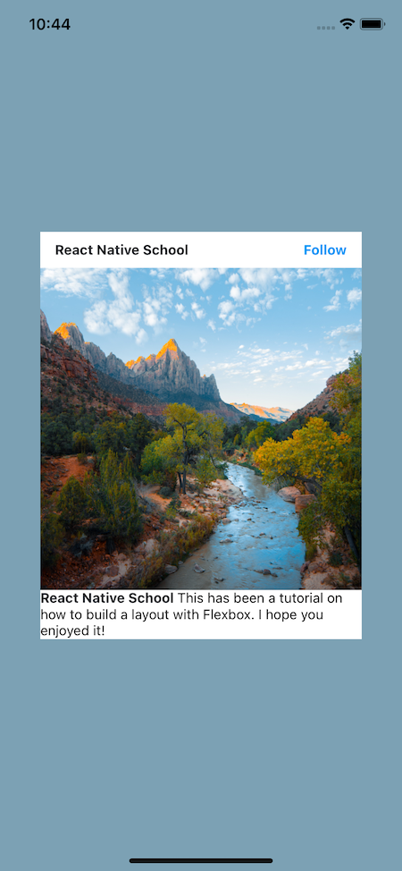
Now, let’s handle the header. We want the text to render in a single line and “stick” to each edge. We can accomplish this by defining the flexDirection and justifyContent. We’ll also set some vertical and horizontal padding:
import React from "react";
import { StyleSheet, View, Text, Image, Dimensions } from "react-native";

export default function App() {
  return (
    <View style={styles.container}>
      <View style={styles.card}>
        <View style={styles.header}>
          <Text style={styles.nameText}>React Native School</Text>
          <Text style={styles.followText}>Follow</Text>
        </View>
        {/* ... */}
      </View>
    </View>
  );
}

const screen = Dimensions.get("screen");
const styles = StyleSheet.create({
        // ...
  header: {
    flexDirection: "row",
    justifyContent: "space-between",
    paddingHorizontal: 15,
    paddingVertical: 10,
  },
});
You can see the updated header below:
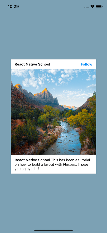
Finally, the footer. All we need to do here is set the padding! Why is that? Because we’ve nested our Text components and applied styling to the name part so we don’t need to worry about the layout here. Work smarter, not harder!
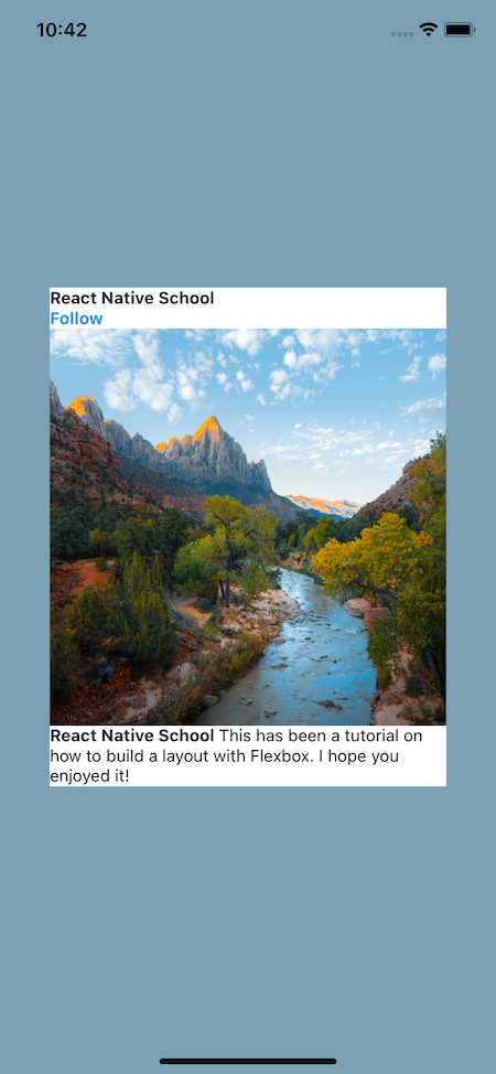
Here’s the final result:
// finished.js

import React from "react";
import { StyleSheet, View, Text, Image, Dimensions } from "react-native";

export default function App() {
  return (
    <View style={styles.container}>
      <View style={styles.card}>
        <View style={styles.header}>
          <Text style={styles.nameText}>React Native School</Text>
          <Text style={styles.followText}>Follow</Text>
        </View>
        <Image
          style={styles.image}
          resizeMode="cover"
          source={{
            uri:
              "<https://images.pexels.com/photos/3225517/pexels-photo-3225517.jpeg?cs=srgb&dl=pexels-michael-block-3225517.jpg&fm=jpg>",
          }}
        />
        <View style={styles.footer}>
          <Text>
            <Text style={styles.nameText}>{`React Native School `}</Text>
            This has been a tutorial on how to build a layout with Flexbox. I
            hope you enjoyed it!
          </Text>
        </View>
      </View>
    </View>
  );
}

const screen = Dimensions.get("screen");
const styles = StyleSheet.create({
  container: {
    flex: 1,
    backgroundColor: "#7CA1B4",
    alignItems: "center",
    justifyContent: "center",
  },
  card: {
    backgroundColor: "#fff",
    width: screen.width * 0.8,
  },
  header: {
    flexDirection: "row",
    justifyContent: "space-between",
    paddingHorizontal: 15,
    paddingVertical: 10,
  },
  image: {
    height: screen.width * 0.8,
  },
  footer: {
    paddingHorizontal: 15,
    paddingVertical: 10,
  },
  nameText: {
    fontWeight: "bold",
    color: "#20232a",
  },
  followText: {
    fontWeight: "bold",
    color: "#0095f6",
  },
});
Here’s our final result:
And that’s an introduction to using flexbox in React Native to build layouts! Flexbox is a dynamic and powerful tool that fits perfectly into the mobile environment.
To learn more about some more obscure properties, check out React Native’s documentation.
LogRocket's Galileo AI watches sessions for you and and surfaces the technical and usability issues holding back your React Native apps.
LogRocket also helps you increase conversion rates and product usage by showing you exactly how users are interacting with your app. LogRocket's product analytics features surface the reasons why users don't complete a particular flow or don't adopt a new feature.
Start proactively monitoring your React Native apps — try LogRocket for free.
As web frontends get increasingly complex, resource-greedy features demand more and more from the browser. If you’re interested in monitoring and tracking client-side CPU usage, memory usage, and more for all of your users in production, try LogRocket.
LogRocket lets you replay user sessions, eliminating guesswork around why bugs happen by showing exactly what users experienced. It captures console logs, errors, network requests, and pixel-perfect DOM recordings — compatible with all frameworks.
LogRocket's Galileo AI watches sessions for you, instantly identifying and explaining user struggles with automated monitoring of your entire product experience.
Modernize how you debug web and mobile apps — start monitoring for free.
Learn how to offload long-running Gemini AI requests to Trigger.dev background jobs in Next.js using Server Actions and real-time React hooks.

Learn how to use Google’s LiteRT.js to build a browser-based OCR receipt scanner with WebGPU acceleration and on-device LLM structuring via LiteRT-LM.
Learn how to use the TypeScript Compiler API and AST traversal to extract imports and build a file dependency graph CLI.

Stop generating AI slop with Claude Code. Discover 5 actionable developer tips to manage context windows, enforce rules with hooks, and improve code quality.
Would you be interested in joining LogRocket's developer community?
Join LogRocket’s Content Advisory Board. You’ll help inform the type of content we create and get access to exclusive meetups, social accreditation, and swag.
Sign up now



 Learn more →