If you work with CSS often, you may have experienced layouts placed side-by-side that break or become misaligned when one side’s size changes. Almost every web designer has faced this, and it can be frustrating to resolve. Luckily, CSS has features allowing you to create web layouts that maintain alignment when their content changes; these are called the subgrid and container queries.

CSS subgrids and container queries are two features that can vastly improve web layout design and responsive web development. This article will dive deeply into CSS subgrids by providing a tutorial on seamlessly using them with container queries.
CSS subgrids are a relatively new feature in the CSS ecosystem, proving to be a significant addition to the level two CSS grid web design and layout specifications.
The elements (child components) you construct and adjust inside a traditional grid container do not directly inherit rows and columns from their parent component. This causes difficulty in consistently aligning them with the parent grid, as each element tends to act independently.
You then have to manage two separate grids, which can get redundant. You can quickly solve this problem by adding subgrid as a value for the grid-template-rows and grid-template-columns properties, because grid child components can now perfectly sync with their parent component.
CSS subgrids allow the child components to inherit their parent row and column settings without maintaining their grid settings.
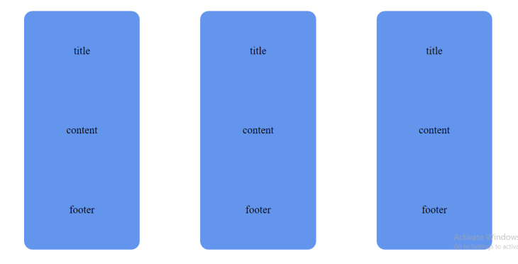
Consider the three cards in a nested grid system below:
Look what happens when you increase the card’s content at the center:
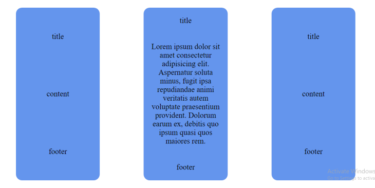
You can immediately see that the title and footer positions get compromised as the content increases.
There are several ways of dealing with this problem. Still, they all end up with you manually managing individual grids in nested grid systems, which can be problematic when working on a larger codebase.
Subgrids now provide an alternative fix that allows rows and columns to maintain their initial position in the grid system despite changing their content.
From my example above, adding subgrid as the value for my card’s grid-template-rows will produce a different output:
.card {
  grid-template-rows: subgrid;
}
Here’s the result:
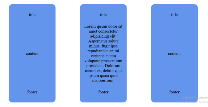
Despite the second card’s content increase, the title and footer elements are still perfectly positioned and in sync with the parent grid.
Subgrid is a significant addition to CSS grid layout specifications because of the ability of child components to inherit the properties of their parent and grandparent components. It comes in handy when building nested grid systems, perfectly aligned form layouts, and other editorial web alignments.
Currently, only Firefox browser supports CSS subgrid, but other popular browsers are not far behind. You can reference this guide to look deeper into CSS subgrids and their functions.
Since the introduction of media queries to browsers, responsive web design has taken a giant step into the future, as you can now design specific layouts for browser viewports.
This is great, but media queries have also exposed a redundancy issue when creating more complex web structures. For instance, components wrapped in a containing section that need to adjust their primary layout properties (like width or height) to line up with a change in the web page’s viewport can affect and break the design.
To solve this problem, keep the component’s media queries in sync with the containing section to ensure that your component looks good on all viewport sizes. You can easily solve this with container queries because instead of viewport sizes, you now design elements based on their actual properties. Container queries allow any component to respond per a specified container.
In a grid system, for instance, child components can align with their container and determine their behavior and responsiveness. You can modify their styles depending on their position in the container (not the viewport). While you can still structure web pages with a responsive grid layout, using container queries is a more straightforward approach to responsive web design.
The first thing to understand about CSS container queries is that while “containers” are the elements being queried, the rules within container queries only affect the container descendants. For instance, if you query a main, section, or perhaps a div as your target container, container queries will allow you to define rules for how elements within them change as the container size changes.
You can create a container query with @container. It looks for the closest containment context:
.card {
  display: flex;
  flex-direction: column;
}

.container {
  background: #fff;
  container-type: layout inline-size
  container-name: something;
}

@container something (min-width: 450px) {
  .card {
    display: flex;
    flex-direction: row
  }
}
The code above is an illustration of working with container queries. It simply instructs the browser to change the value of the card’s flex-direction column to row if the container’s width is at least 450px.
Container queries were specified to be included in CSS containment. Three properties accompany them:
container-typeThis property assigns a query container to an element so that its child components can query several aspects of its layout features.
size creates a query container for block and inline axis dimensional queries. Layout, style, and size containment are applied to the elementinline-size creates a query container for dimensional queries on the container’s inline axis. The element’s layout, style, and inline-size containment are appliedblock-size creates a query container for dimensional queries on the container’s block axis. Layout, style, and block-size containment are applied to the elementstyle is for style queries, and creates a query containerstate creates a query container for state queriescontainer-nameAn optional property that further specifies the container’s name. This attribute acts as an escape hatch when we don’t want to target the nearest parent container.
Consider the code below:
.sidebar {
  container-type: inline-size;
  container-name: sidebar;
}
The CSS above generates a container with a specified name (sidebar) that only contains content on the inline axis, meaning that the content can grow as much as it needs to on the block axis. You can then query that specific container with its container-name like so:
@container sidebar (min-width: 450px){
  .card {
    display: flex;
    flex-direction: row
  }
}
containerThis property is often used as a shorthand property you can use to set both container-type and container-name in one statement.
Container queries are appropriate for highly reusable components with a layout dependent on the available container space. They can be used in various situations or added to multiple containers on the page.
Other container query use cases include:
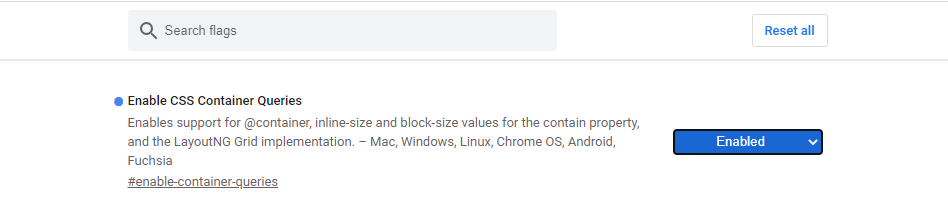
Most browsers still do not support container queries, but you can readily test their features on Google Chrome Canary. Head to chrome://flags and enable CSS Container Queries:
You can also experiment with container queries on Mozilla Firefox by heading to about:config and enabling layout.css.container-queries:
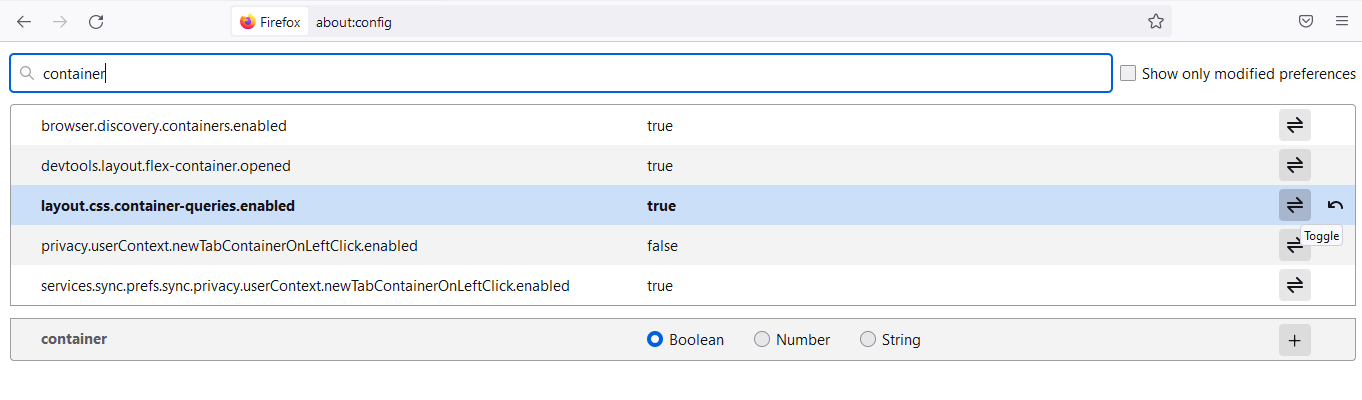
Container queries are currently in their first public working draft, but it is a feature that has proven helpful and is likely to be incorporated in all browser versions.
CSS subgrids and container queries are two fascinating CSS features that I think will change your approach to webpage layout design and responsive styling, but how can we combine them?
Say we have a section containing three articles in the following format:
<section class="container">
  <article class="article1">...</article>
  <article class="article2">...</article>
  <article class="article3">...</article>
</section>
Now let’s place these articles in a nested grid system where subgrids and container queries can play their roles:
/* this creates a container with containment on the inline axis only and gives it an optional name "main" */
html, section {
  container-type: inline-size;
  container-name: main;
}

/* targeting the section's minimum width at "60ch" */
@container main (min-width: 60ch) {
  section {
    display: grid;
    grid-template-columns: 1fr 1fr;
  }
}

/* targeting the section's minimum width at "100ch" */
@container main (min-width: 100ch) {
  article {
    padding: 1rem;
    font-size: 1rem;
    border: 1px solid #000;
    margin: 10px 20px;
    display: grid;
    grid-template-rows: auto 1fr auto;
  }

  /* enabling a more responsive grid layout so elements don't break */
  .article1, .article2 {
    grid-template-columns: subgrid;
  }

  .article3 {
    display: grid;
    grid-column: span 2;
  }
}

/* targeting the section's containment context at a maximum width of "100ch" */
@container main (max-width: 100ch) {
  main {
    display: flex;
    flex-direction: column;
  }
}
From the above CSS code, we made the first two columns take as much space in a two-column grid system as the third one, which is just below. We then created a subgrid inside the article to ensure the elements inside are in sync and can’t break, even when the article’s content is increased.
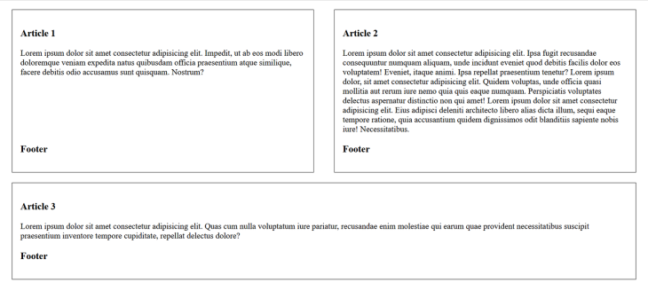
To make this system more responsive, we had to target the section and set some container query rules that apply to the articles as their descendants. You may notice that we queried the inline-size property of the section because we want the article (child) components to grow or shrink inline with the section’s (container) width.
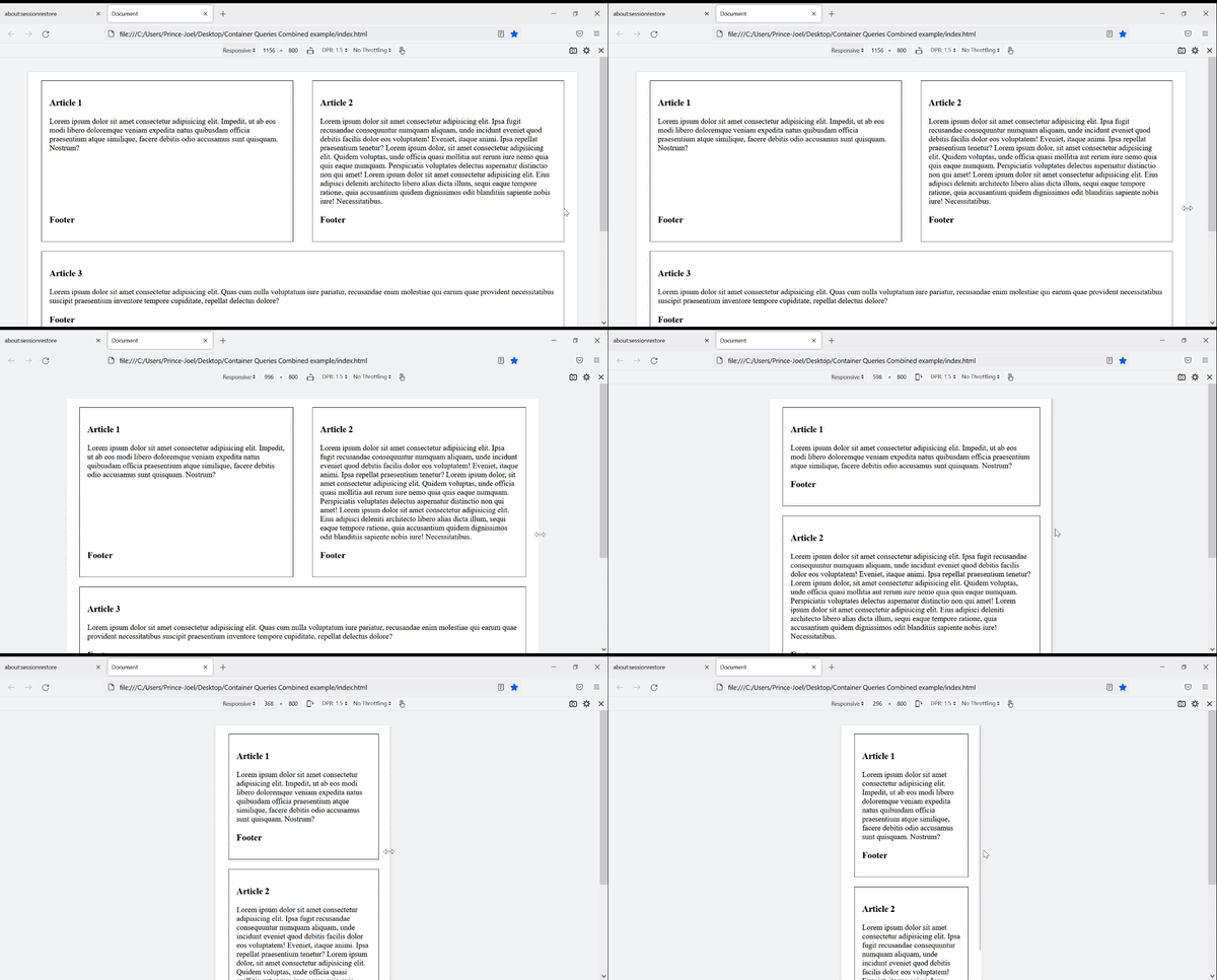
In this case, we made the articles flex in the column direction when the section’s width is at a maximum of 80ch. This enables our articles to respond not to the viewport size but their container’s width.
Here’s the result:
This article covered CSS subgrids and container queries, their workings, and use cases. We were also able to experiment with both concepts and combine them to bring about a responsive layout. Container queries and CSS subgrids are currently in their first public working draft, but they are features that have proven helpful and are likely to be incorporated in most new browser versions.
I hope this article was valuable to you. Happy coding!
As web frontends get increasingly complex, resource-greedy features demand more and more from the browser. If you’re interested in monitoring and tracking client-side CPU usage, memory usage, and more for all of your users in production, try LogRocket.
LogRocket lets you replay user sessions, eliminating guesswork around why bugs happen by showing exactly what users experienced. It captures console logs, errors, network requests, and pixel-perfect DOM recordings — compatible with all frameworks.
LogRocket's Galileo AI watches sessions for you, instantly identifying and explaining user struggles with automated monitoring of your entire product experience.
Modernize how you debug web and mobile apps — start monitoring for free.

Learn how to offload long-running Gemini AI requests to Trigger.dev background jobs in Next.js using Server Actions and real-time React hooks.

Learn how to use Google’s LiteRT.js to build a browser-based OCR receipt scanner with WebGPU acceleration and on-device LLM structuring via LiteRT-LM.

Learn how to use the TypeScript Compiler API and AST traversal to extract imports and build a file dependency graph CLI.

Stop generating AI slop with Claude Code. Discover 5 actionable developer tips to manage context windows, enforce rules with hooks, and improve code quality.
Hey there, want to help make our blog better?
Join LogRocket’s Content Advisory Board. You’ll help inform the type of content we create and get access to exclusive meetups, social accreditation, and swag.
Sign up now


 Learn more →