Imagine developing a mobile application that looks perfect on your test device, only to discover it appears broken on users’ tablets.

This is a recurring challenge in both mobile and web development. As devices continue to diversify in size and capability — from compact smartphones to expansive tablets and foldables — creating interfaces that adapt seamlessly across all devices has become not just a luxury, but a necessity for success.
In this guide, we’ll explore different ways we can build adaptive user interfaces in React Native. We’ll dive deep into the tools, techniques, and best practices that ensure your application delivers a consistent, optimized experience across any device.
By the end, you’ll understand how to transform fixed layouts into fluid ones and use scaling to create responsive designs — an important foundation for building truly adaptive interfaces.
An adaptive UI changes itself to fit the device it’s running on. Some parameters you’ll use include:
Responsive layouts are like flexible containers for your app. They stretch or shrink to fit any screen size. Pictures and videos are resized to look good, and everything keeps the right spacing no matter the screen size.
Adaptive components have enough context about the device and its surroundings to make the right maneuver in every situation. They can rearrange themselves when there isn’t enough space. They also know whether they’re running on iPhone or Android and adjust how they look. When you turn your phone sideways, these components move to fit the new shape.
With this in mind, we can get to the practical implementation of adaptive UI with the code below.
Create a new folder anywhere on your machine, then open that directory in your terminal and run this command:
npx create-expo-app .
This will create a new React Native project in your folder using Expo, NativeWind, and TypeScript. Now you can start the development server by running:
npm run start
This command will initiate the Metro bundler, and shortly afterwards, a QR code should appear in your terminal.
To view your application on your phone during development, ensure that you have Expo Go installed on your mobile device beforehand.
If you’re on Android, launch Expo Go and select the “Scan QR code” option. For iOS users, open the camera app and scan the QR code displayed. Once scanned, you’ll receive a prompt with a link to open the application in Expo Go.
SafeAreaView: Handling notches and safe areas on iOSFlagship smartphones come in various designs, with the iPhone notably having camera notches and Samsung having edge-to-edge displays.
If not handled correctly, these elements can block important parts of an app’s content. This is where the SafeAreaView component in React Native comes in.
SafeAreaView is designed to render content within the “safe area”—the part of the screen that is free from hardware interference.
Here’s an example. In the register route of the application, we have a text event on the screen that laps on the status bar:
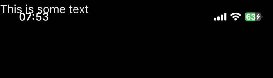
By using SafeAreaView at the start of this component, we ensure that subsequent content remains visible and comfortably positioned across all devices:
import { SafeAreaView } from 'react-native'
import { ThemedText } from '@/components/ThemedText'

export default function RegisterRoute () {
  <>
    <SafeAreaView />
    <ThemedText>This is some text </ThemedText>
  </>
}
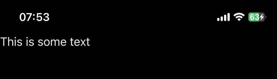
Your background knowledge of dynamic values in CSS will serve you when creating adaptive user interfaces. By using percentage-based dimensions, we can make elements responsive, allowing them to adjust based on the screen size.
For instance, using the following CSS, the box element will occupy 50% of its parent container’s width and height:
.box {
  width: 50%; /* Box will take up 50% of the parent element's width */
  height: 50%; /* Box will take up 50% of the parent element's height */
}
We can further refine the behavior by setting a maximum width and height to ensure that the element remains within specified limits:
.box {
  width: 80%; /* Box will take up 80% of the parent element's width */
  max-width: 1000px; /* Box will not exceed 1000px in width */
  height: 50%; /* Box will remain 50% of the parent element's height */
  max-height: 1000px; /* Box will not exceed 1000px in height */
}
In this case, the max``-w``idth and max``-h``eight values act as the upper boundary for the box’s dimensions — it will maintain its responsive behavior, but it won’t grow beyond 1000px in either dimension.
useWindowDimensions hookReact Native provides two methods you can use to read the value of the device’s current width and height in our components. Let’s start with the Dimensions API first.
The Dimensions API in React Native provides a way to retrieve information about the device’s dimension. You can use Dimensions.get() to return the 'screen' or 'window' dimensions.
The key difference is that 'screen' refers to the actual size of the entire device screen, including the status bar and any notches, while 'window' gives the size of the usable area, excluding elements like the status bar. 'window' is preferred for most use cases.
Here’s an example:
import { Dimensions } from 'react-native';

const screenWidth = Dimensions.get('screen').width;
const screenHeight = Dimensions.get('screen').height;
const windowWidth = Dimensions.get('window').width;
const windowHeight = Dimensions.get('window').height;
One limitation of Dimensions.get() is that the height and width values are calculated once — on the initial render. If the device’s orientation or window size get bigger, the values won’t automatically update unless you handle it manually within the component body.
For example, without an update, a component wouldn’t respond to orientation changes:
import { Dimensions, StyleSheet, Text, View } from 'react-native'

const screenWidth = Dimensions.get('screen').width

export default function MyComponent() {
  return (
    <View style={styles.container}>
      <Text>MyComponent</Text>
    </View>
  )
}

const styles = StyleSheet.create({
  container: {
    padding: screenWidth < 350 ? 24 : 48, // this will only apply on first render and not subsequent renders
  },
})
The useWindowDimensions hook provides a more efficient and automatic solution. It dynamically updates whenever the window dimensions change, ensuring that your app always reflects the current size, even during orientation changes:
import { useWindowDimensions } from 'react-native';

const MyComponent = () => {
  const { width, height } = useWindowDimensions();

  return (
    <View>
      <Text>Width: {width}</Text>
      <Text>Height: {height}</Text>
    </View>
  );
};
With useWindowDimensions, your component is always in sync with the device’s dimensions, making it ideal for responsive layouts.
Platform moduleThe Platform module in React Native is a powerful tool for creating adaptive interfaces that respond to the unique design requirements of iOS and Android. By detecting the platform the app is running on, we can apply specific styles, behaviors, or components that suit each operating system.
This is particularly helpful for features that are implemented differently on each platform, like shadows, which work natively on iOS and Android in different ways.
Here’s an example of using the Platform module to apply shadow styling based on the operating system:
import { StyleSheet, Platform, View, Text } from 'react-native';

const styles = StyleSheet.create({
  box: {
    width: 200,
    height: 200,
    backgroundColor: '#fff',
    ...Platform.select({
      ios: {
        shadowColor: '#000',
        shadowOffset: { width: 0, height: 2 },
        shadowOpacity: 0.3,
        shadowRadius: 4,
      },
      android: {
        elevation: 5,
      },
    }),
  },
});

const ShadowBox = () => (
  <View style={styles.box}>
    <Text>Shadow on iOS and Android</Text>
  </View>
);

export default ShadowBox;
In this example, Platform.select() applies iOS-specific shadow properties like shadowColor, shadowOffset, shadowOpacity, and shadowRadius.
On Android, the elevation property is used instead, as it handles shadows natively on that platform. By using the Platform module, you can ensure the interface looks consistent and follows each platform’s design standards.
Making an app adaptive goes beyond adjusting to different screen sizes; it also means responding to changes in screen orientation.
Picture this, if you will: a user is switching back and forth between your app and another one in landscape mode — perhaps to copy information needed to complete a task on your app.
These days, a quick swipe can easily take you back and forth between apps, but if your app was locked in portrait mode, it becomes frustrating to toggle between both apps.
By default, React Native apps are set to portrait orientation with, you guessed it, "``portrait``", which works well for most applications. However, neglecting landscape view is not an option for apps with video streaming, gaming, or similar use cases.
Fortunately, React Native offers a straightforward way to handle orientation changes. You can configure this setting in the app.json file by setting the orientation value to "default", which supports both portrait and landscape modes. Once you get past the funny naming convention, your code will look like this:
// app.json
{
  "expo": {
    "name": "adaptive-ui",
    "slug": "adaptive-ui",
    "orientation": "default"
  }
}

KeyboardAvoidingViewWhile your app can now handle different orientations, orientation changes may cause layout issues if not handled properly. For example, when a user fills out a registration form in landscape mode, the on-screen keyboard might cover the input fields, making the form difficult to complete:

To address this, wrap your component in React Native’s KeyboardAvoidingView component. This will adjust the view when the keyboard appears, using height, position, and padding properties to keep the focused input visible:
// app/(tabs)/register.tsx
import React from 'react';
import {
  Text,
  TextInput,
  ScrollView,
  StyleSheet,
  SafeAreaView,
  View,
  KeyboardAvoidingView,
  Pressable,
} from 'react-native';
import { useForm, Controller } from 'react-hook-form';
import { ThemedText } from '@/components/ThemedText';
import CustomInput from '@/components/CustomInput';

interface FormData {
  // form interface
}

const RegistrationForm: React.FC = () => {
  const { control, handleSubmit } = useForm<FormData>();

  const onSubmit = (data: FormData) => {
    console.log(data);
  };

  return (
    <KeyboardAvoidingView className='flex-1' behavior='padding'>
      <SafeAreaView />
      <ScrollView className='flex-1 p-10'>
        <ThemedText style={styles.title} className='pb-6'>
          Registration Form
        </ThemedText>
        <Controller
          control={control}
          rules={{ required: 'First name is required' }}
          render={({ field }) => (
            <CustomInput label='First Name' placeholder='First Name' {...field} />
          )}
          name='firstName'
        />
        {/*  other form fields... */}
        <Pressable style={styles.button} onPress={handleSubmit(onSubmit)}>
          <ThemedText style={styles.buttonText}>Submit</ThemedText>
        </Pressable>
      </ScrollView>
    </KeyboardAvoidingView>
  );
};

const styles = StyleSheet.create({
  // styles
});

export default RegistrationForm;
Note: Since KeyboardAvoidingView triggers a scroll to focus on the selected input, wrap your form components in ScrollView to support the scroll behavior.
In the previous dynamic dimensions with CSS values section, we explored basic width and height settings in React Native and learned how to make them adaptive using percentage values.
Those rules still apply when creating responsive images. However, there are more techniques we can use to create images that adapt to different screen sizes and orientations.
Images in RN have a resizeMode property which is the equivalent of CSS’s object-fit property on the web — this controls how an image fits within its container.
Here are the different resizeMode options, what they do, and their similarity to object-fit:
"cover" (like object-fit: cover) — Scales the image to fill the container, maintaining its aspect ratio and cropping if needed"contain" (like object-fit: contain) — Scales the image to fit within the container without cropping, also preserving the aspect ratio"stretch" (like object-fit: fill) — Stretches the image to fit the container without maintaining its original aspect ratio, which may lead to distortion"center" (like object-fit: none) — Uses the image’s original size, no scaling, may leave empty spaceHere’s how to apply the resizeModemode property to an image:
<Image
  style={styles.image}
  source={require('@/assets/images/car_in_dystopian_landscape.png')}
  resizeMode="contain"
/>
You can dynamically retrieve the device’s dimensions with the useWindowDimensions hook, allowing you to adjust image dimensions based on the actual screen size.
This is useful for scenarios where precise control over image size is required, such as controlling the aspect ratio or modifying resizeMode. Take this component for example:
export default function HomeScreen() {
  const { width, height } = useWindowDimensions()

  return (
    <ThemedView className='flex-1 py-10 px-5'>
      <SafeAreaView />
      <Image
        style={[
          styles.image,
          {
            width,
            height: width * 0.5625, // 16:9 aspect ratio
          },
        ]}
        source={require('@/assets/images/car_in_dystopian_landscape.png')}
        resizeMode='cover'
      />
    </ThemedView>
  )
}
You could also change the resizeMode value depending on the device’s dimensions:
export default function HomeScreen() {
  const { width, height } = useWindowDimensions()

  return (
    <ThemedView className='flex-1 py-10 px-5'>
      <SafeAreaView />
      <Image
        style={[
          styles.image,
          {
            width,
            height: width < 480 ? '50%' : '100%',
          },
        ]}
        source={require('@/assets/images/car_in_dystopian_landscape.png')}
        resizeMode={width < 480 ? 'contain' : 'cover'}
      />
    </ThemedView>
  )
}
The aspectRatio property ensures that the width and height of an image maintain a consistent ratio across screen sizes.
For example, setting aspectRatio: 1 would make an image square, while aspectRatio: 16/9 would keep it in a landscape orientation. This is especially useful for media-heavy applications where maintaining the visual quality of images is crucial, regardless of screen dimensions:
<Image
  source={{ uri: 'https://example.com/image.jpg' }}
  style={{ width: '100%', aspectRatio: 16 / 9, resizeMode: 'cover' }}
/>
These three methods — resizeMode, aspectRatio, and Dimensions API — give you comprehensive control over how images adapt to different screen sizes and orientations. Using them effectively will help create adaptive images that react to any device’s dimensions.
react-native-size-mattersSo far we’ve been using static values to modify height and width dimensions. However, this approach isn’t ideal for accommodating different device sizes.
A more effective solution is to approach each dimension with a scaling perspective, where dimensions are defined in a way that automatically adjusts the size of elements across various devices.
What if you had a set of utility functions that scale your UI elements dynamically, ensuring consistent proportions without the need for manual adjustments? Enter react-native-size-matters.
This is a lightweight, zero-dependency library that helps scale the size of your UI across different devices. It uses a five-inch screen as its guideline with the following three utilities:
scale(size: number) — Returns a linear scaled result of the provided size, based on your device’s screen widthverticalScale(size: number) — Returns a linear scaled result of the provided size, based on your device’s screen heightmoderateScale(size: number, factor?: number) — Comes in handy when you don’t want to scale linearly and instead define your factor scale. The default factor is 0.5These functions can access updated information about your screen size, allowing them to be dynamic.
To install, run:
npm install react-native-size-matter
You can apply these functions on both element dimensions, padding, margin, and font size values:
import { scale, verticalScale, moderateScale } from 'react-native-size-matters';
// these functions also have shortened names
// import { s, vs, ms } from 'react-native-size-matters';

const Component = props =>
<View style={{
  width: scale(30),
  height: verticalScale(50),
  padding: moderateScale(5),
  margin: moderateScale(5, 1)
}}/>;
react-native-size-matters also ships with a ScaledSheet style sheet which you can use with “@-prefixed”annotations to achieve the same scaling effect:
import { ScaledSheet } from 'react-native-size-matters';

const styles = ScaledSheet.create({
  container: {
    width: '100@s', // = scale(100)
    height: '200@vs', // = verticalScale(200)
    padding: '2@msr', // = Math.round(moderateScale(2))
    margin: 5
  },
  row: {
    padding: '[email protected]', // = moderateScale(10, 0.3)
    width: '50@ms', // = moderateScale(50)
    height: '[email protected]' // = moderateVerticalScale(30, 0.3)
  }
});
I find this package to be game-changing. It lets you develop your UI once and scale consistently across different devices. You also won’t have to rely heavily on the Dimensions API to adjust your interface.
Creating adaptive UIs in React Native requires a thoughtful combination of built-in components, external libraries, and careful attention to user activity.
Using native components like SafeAreaView, KeyboardAvoidingView or a tool like react-native-size-matters, developers can create interfaces that seamlessly adapt to any device or orientation.
Approach adaptivity as a core feature rather than an afterthought by doing the following:
react-native-size-mattersRemember that building adaptive UIs is an iterative process. Start with the basics, test extensively, refine your approach based on real-world usage patterns, and always seek user feedback!
LogRocket's Galileo AI watches sessions for you and and surfaces the technical and usability issues holding back your React Native apps.
LogRocket also helps you increase conversion rates and product usage by showing you exactly how users are interacting with your app. LogRocket's product analytics features surface the reasons why users don't complete a particular flow or don't adopt a new feature.
Start proactively monitoring your React Native apps — try LogRocket for free.

Learn how to offload long-running Gemini AI requests to Trigger.dev background jobs in Next.js using Server Actions and real-time React hooks.

Learn how to use Google’s LiteRT.js to build a browser-based OCR receipt scanner with WebGPU acceleration and on-device LLM structuring via LiteRT-LM.
Learn how to use the TypeScript Compiler API and AST traversal to extract imports and build a file dependency graph CLI.

Stop generating AI slop with Claude Code. Discover 5 actionable developer tips to manage context windows, enforce rules with hooks, and improve code quality.
Would you be interested in joining LogRocket's developer community?
Join LogRocket’s Content Advisory Board. You’ll help inform the type of content we create and get access to exclusive meetups, social accreditation, and swag.
Sign up now


 Learn more →