Chakra UI is a web developer’s best friend. A component-based library made up of basic building blocks you can use to build web applications, Chakra UI helps you “build accessible React apps with speed.”

Chakra UI’s components are accessible and WAI-ARIA compliant, and its API makes customizing and theming components easy. But this does not even scratch the surface of the benefits it provides developers.
Our focus in this article is to look at some of the cool things we can do with Chakra UI that move beyond the basics, and how they can boost our productivity as developers. I prepared a demo of the things we will look at. Here are the links to the article demo and the GitHub repo if you’d like to follow along.
This article is written with Next.js. The implementations of Chakra UI are similar across the React ecosystem, however, there will be some differences when it comes to concepts like routing, which I will point out when we arrive at them in the tutorial.
This is what we’ll be covering:
When creating different themes for your website, you may want to dynamically change your SVGs to fit the current theme. This means creating different versions of each SVG for each theme.
While this technically works, Chakra UI provides a cleaner method. We can use Chakra UI’s useColorMode hook to programmatically change the fill of our SVGs and make them dynamic.
Before we can make use of useColorMode, we need to implement dark mode. This guide can help if you haven’t used dark mode with Chakra UI already.
Once dark mode has been configured, we can use useColorMode:
import { LightBulb, Moon, Sun, Vercel } from "../svgs";
import { Box, Button, Center, Stack, useColorMode } from "@chakra-ui/react";

export default function SVG() {
  const { colorMode, toggleColorMode } = useColorMode();

  return (
    <Center>
      <Box>
        <Center>
          <Button onClick={toggleColorMode}>
            Switch to {colorMode === "light" ? "Dark" : "Light"}
          </Button>
        </Center>
        <Stack direction={["column", "row"]} spacing="24px" mt={14}>
          <LightBulb colorMode={colorMode} />
          <Moon colorMode={colorMode} />
          <Sun colorMode={colorMode} />
          <Vercel colorMode={colorMode} />
        </Stack>
      </Box>
    </Center>
  );
}
In the code snippet above, we import the useColorMode hook and the SVGs that we want to make dynamic. We can access colorMode and toggleColorMode from useColorMode. colorMode is the current color mode, and toggleColorMode is the function to toggle the color mode.
We pass the toggleColorMode function to the button’s onClick event handler and colorMode to the SVG components:
function lightBulb({ colorMode }) {
  return (
    <svg
      xmlns="http://www.w3.org/2000/svg"
      x="0"
      y="0"
      enableBackground="new 0 0 480.8 480.8"
      version="1.1"
      viewBox="0 0 480.8 480.8"
      xmlSpace="preserve"
      width="200px"
    >
      <path
        fill={colorMode === "light" ? "#FFD517" : "#111"}
        d="M317.112 314.4c-22.4 22.4-19.6 67.6-19.6 67.6h-113.6s2.4-45.2-19.6-67.6c-24.4-21.6-40-52.8-40-87.6 0-64 52-116 116-116s116 52 116 116c0 34.8-15.2 66-39.2 87.6z"
      ></path>
      <g fill={colorMode === "light" ? "#210B20" : "#E5E5E5"}>
        <path d="M300.712 417.6c0 6-4.8 10.8-10.8 10.8h-98.8c-6 0-10.8-4.8-10.8-10.8 0-6 4.8-10.8 10.8-10.8h98.4c6 0 11.2 4.8 11.2 10.8zM285.912 462.4c0 6-4.8 10.8-10.8 10.8h-69.2c-6 0-10.8-4.8-10.8-10.8 0-6 4.8-10.8 10.8-10.8h69.2c6 0 10.8 4.8 10.8 10.8z"></path>
      </g>
      <g fill={colorMode === "light" ? "#FFD517" : "#210B20"}>
        <path d="M323.112 318.4c26-23.6 40.8-56.8 40.8-91.6 0-68-55.6-123.6-123.6-123.6s-123.6 55.6-123.6 123.6c0 35.6 15.6 69.6 42
In the SVG component, we access colorMode and conditionally change the fill of the paths based on the current mode. This is a cleaner and more effective manner of setting up dynamic SVGs.
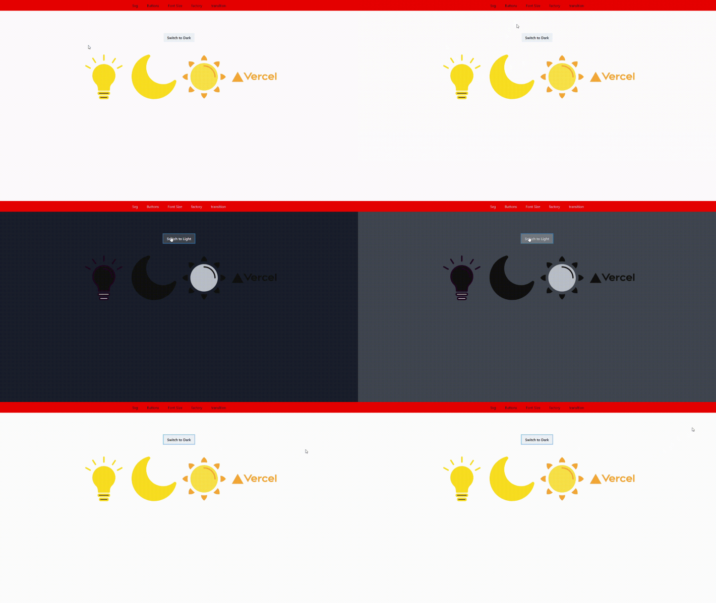
With that, we have successfully made the SVGs dynamic as shown in the gif below:
Theming in Chakra UI follows the Styled System Theme Specification approach. We use a theme object to define our application’s color palette, font, breakpoints, spacing, and more.
To extend or override a token in the default theme, we import the extendTheme function and add the keys we want to override. Let’s see how to extend the theme object.
To get started, we create a Theme.js file, then create the style definitions for our application there:
import { extendTheme } from "@chakra-ui/react";

const themes = {
  colors: {
    brand: {
      100: "#ff0000",
      80: "#ff1a1a",
    },
  },
};
const theme = extendTheme(overrides);

export default theme;
We extend the colors by adding two new ones (our brand colors) in the theme object. We can also define style tokens for fonts, breakpoints, font sizes, line heights, and more, depending on the application’s design requirements.
To use this new theme object with the extended styles added, we go to the root of our application, where we set up ChakraProvider:
import { ChakraProvider } from "@chakra-ui/react";
import theme from "theme";
import Nav from "Nav";

function MyApp({ Component, pageProps, router }) {
  return (
    <ChakraProvider theme={theme}>
      <Nav />
      <Component {...pageProps} />
    </ChakraProvider>
  );
}
export default MyApp;
Next, we pass the theme object we defined to ChakraProvider. Now Chakra components can access the brand colors throughout the application.
There may be cases in which your project does not call for a style extension, but rather the overriding of Chakra’s default component styles.
Chakra component styles consist of baseStyle, sizes, variants, and an optional defaultProps to denote the default size or variant.
Here’s what the component style object looks like:
const ComponentStyle = {
  // style object for base or default style
  baseStyle: {},
  // styles for different sizes ("sm", "md", "lg")
  sizes: {},
  // styles for different visual variants ("outline", "solid")
  variants: {},
  // default values for `size` and `variant`
  defaultProps: {
    size: "",
    variant: "",
  },
}
Let’s override the base styles of the Button and Heading components.
Like we did when extending styles, we create a theme.js file:
const overrides = {
  components: {
    Button: {
      baseStyle: {
        borderRadius: "none",
      },
      sizes: {
        small: {
          px: 5,
          h: "50px",
          fontSize: "20px",
        },
        medium: {
          px: 7,
          h: "60px",
          fontSize: "25px",
        },
        large: {
          px: 8,
          h: "70px",
          fontSize: "30px",
          borderRadius: "10px",
        },
      },
      variants: {
        primary: {
          bg: "primary",
          color: "#fff",
        },
        secondary: {
          bg: "secondary",
          color: "#fff",
        },
        ghost: {
          bg: "transparent",
          border: "1px solid red",
        },
        primaryGhost: {
          bg: "transparent",
          border: "1px solid",
          borderColor: "primary",
        },
        secondaryGhost: {
          bg: "transparent",
          border: "1px solid",
          borderColor: "secondary",
          _hover: {
            color: "#fff",
            bg: "#BB1415",
          },
        },
      },
    },

    Heading: {
      baseStyle: {
        fontFamily: "Inter",
        fontWeight: "600",
      },
      sizes: {
        small: {
          fontSize: "20px",
        },
        medium: { fontSize: "25px" },
        large: { fontSize: "30px" },
      },
    },
  },
};

const theme = extendTheme(overrides);
export default theme;
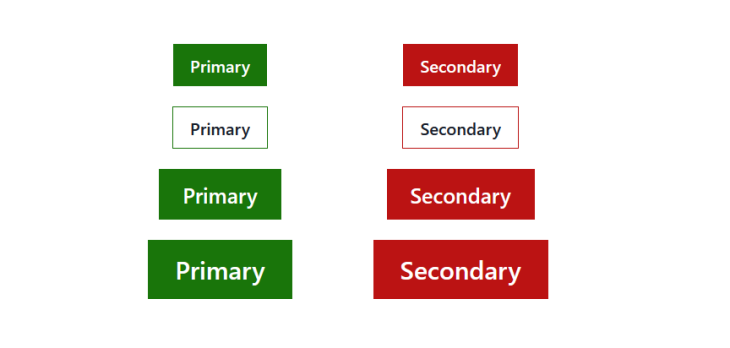
For the Button’s baseStyle, we remove the default border-radius. For the Heading‘s base style, we change its font type and weight. These examples serve to show how we can override the default styles of Chakra components.
Being able to extend or override the styles of Chakra components gives us fine-grain control over the look and feel of our interfaces.
We can see that the button with the border radius removed in the image below:
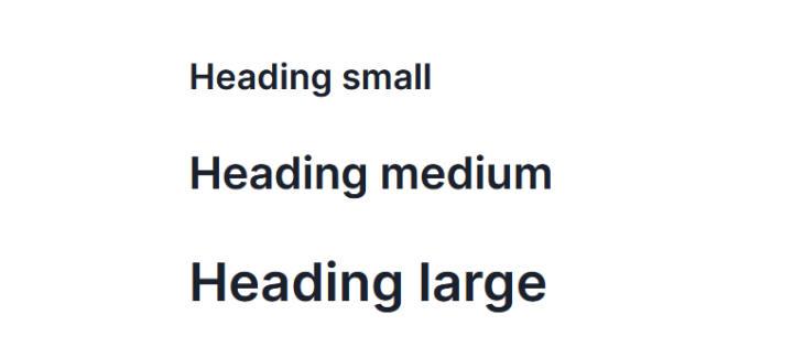
The headings now have a font weight of 600 by default:
Chakra Factory enables third-party components to receive Chakra’s style props. This reduces the need to create custom component wrappers when integrating third party components with Chakra UI.
This reference shows the list of HTML elements that Chakra factory supports:
import Image from "next/image";
import { Box, Center, chakra, HStack, VStack } from "@chakra-ui/react";
import woman from "../public/woman.jpg";

const ChakraNextImage = chakra(Image);

export default function factory() {
  return (
    <Center>
      <HStack spacing={10}>
        <Box width="400px" h="400px" position="relative">
          <ChakraNextImage
            src={woman}
            alt="an img"
            layout="fill"
            objectFit="cover"
            borderRadius="full"
          />
        </Box>
      </HStack>
    </Center>
  );
}
In the code snippet above, we integrate the Next.js Image component with Chakra UI. Then, we set up a ChakraNextImage component, and through it, we can pass Chakra’s style props to Image.
You can define animations using Chakra UI’s keyframes helper. keyframes takes in a CSS keyframe definition and returns an object you can use in styles:
import {
  Box,
  Button,
  Center,
  VStack,
  keyframes,
} from "@chakra-ui/react";
import { LightBulb } from "svgs";

const spin = keyframes`
  from {transform: rotate(0deg);}
  to {transform: rotate(360deg)}
`;

export default function Transition() {
  const spinAnimation = `${spin} infinite 2s linear`;
  return (
    <Center>
      <VStack spacing={20}>
        <Box animation={animation}>
          <LightBulb />
        </Box>
      </VStack>
    </Center>
  );
}
Above, we set up a spin animation with the keyframes helper. We can add animations to Chakra UI elements through the animation prop.
Next, we pass spinAnimation to the Box component in order to add animations to our applications using Chakra UI.
We can add page transitions to our applications to enhance the user’s experience as they navigate from one page to another. I’ll be using Next.js for this demo, which has a different routing system from React. Take note of this if you intend to recreate this page transition with React.
Now let’s see how to do this with Chakra UI:
import { ChakraProvider, ScaleFade } from "@chakra-ui/react";
import theme from "theme";
import Nav from "Nav";

function MyApp({ Component, pageProps, router }) {
  return (
    <ChakraProvider theme={theme}>
      <Nav />
      <ScaleFade
        key={router.route}
        initialScale={0.9}
        in="true"
      >
        <Component {...pageProps} />
      </ScaleFade>
    </ChakraProvider>
  );
}
export default MyApp;
To add page transitions, we make use of Chakra UI’s transition components. In the code snippet above, we use the ScaleFade transition.
In order for the transition to work as the user navigates the application, we need to inform ScaleFade of the current route. We access the information about the current route from the Next.js router object, then pass the route to ScaleFade’s key prop. We set the initial scale of the transition through the initialScale prop and set the transition to occur when the component renders by setting the in prop to true.
It is one thing to know how Chakra UI works and another to implement UIs in a way that scales. Let’s look at a common scenario developers find in the workspace.
You were given the screenshot below as part of the UI design for a project you need to implement. We can implement this in a way that does not scale and one that does.
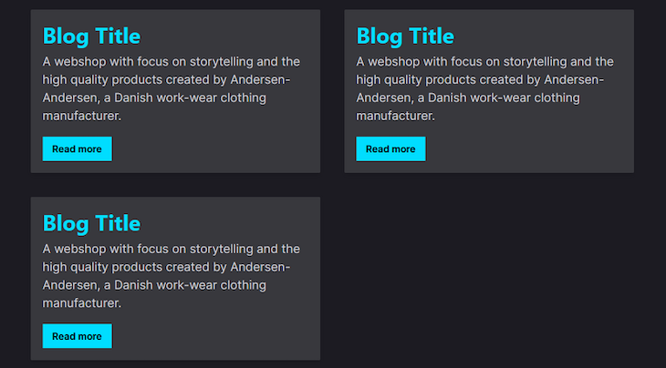
Let’s start with the non-scalable implementation. We start with creating a BlogCard component:
import { Box, Heading, Text, Button } from "@chakra-ui/react";

export default function BlogCard() {
  return (
    <Box
      borderRadius="sm"
      background="#38383d"
      boxShadow="md"
      _hover={{background: "#42414d" }}
    >
     <Box p={5}>
        <Heading pb={2} color="#00DDFF">
          Blog Title
        </Heading>
        <Text fontSize={["lg", "xl"]}>
          A webshop with focus on storytelling and the high quality products
          created by Andersen-Andersen, a Danish work-wear clothing
          manufacturer.
        </Text>
        <Button mt="5" color="black" bg="#00DDFF" borderRadius="none">
          Read more
        </Button>
      </Box>
    </Box>
  );
}
This gets the job done. However, it won’t scale over time, particularly if changes are made to the initial design.
Why won’t it scale? Because things like the color and background color definitions for the Heading and Button have been passed in directly instead of defining them through the theme object.
If you are working solo as a developer or on a small application, you may be able to easily track the BlogCard.js file and change the color and background, but as the project becomes more complex, files increase, and you work with multiple people in your team, this no longer scales.
Let’s look at a scalable implementation of this design. One of the starting points in writing scalable code when working with Chakra UI is to always define the design tokens for your project in the theme.js file.
We’ve seen how to extend and customize themes earlier in this article:
const Theme = extendTheme({
  colors: {
    brand: {
      primary: "#00DDFF",
      greyPrimary: "#38383d",
      greySecondary: "#42414d",
    },
  },
});
export default Theme;
Next we use the brand colors in the Heading and Button components:
import { Box, Heading, Text, Button } from "@chakra-ui/react";
export default function Card() {
  return (
    <Box
      borderRadius="sm"
      background="brand.greyPrimary"
      boxShadow="md"
      _hover={{ background: "brand.greySecondary" }}
    >
      <Box p={5}>
        <Heading pb={2} color="brand.primary">
        //more code below
        <Button mt="5" color="black" bg="brand.primary" borderRadius="none">
          Read more
        </Button>
      </Box>
    </Box>
  );
}
With this implementation, no matter how complex your codebase grows or the number of people working on the project, your code remains scalable, because changing a design is as simple as going into your theme.js file where your style definitions live.
Another scenario is dealing with font sizes. Say we had an H1 Heading that is the same across all pages. We can define the styles and paste them in every page like so:
<Heading
  fontWeight={600}
  fontSize={"3xl"}
  lineHeight={"110%"}
>
  I am the main h1 page heading
</Heading>
However, not only is this not scalable, it is also not DRY.
We could also abstract the code into a PageHeading component and pass the heading text through props:
import { Heading } from "@chakra-ui/react";

export default function PageHeading({ text }) {
  return (
    <Heading
      fontWeight={600}
      fontSize={"3xl"}
      lineHeight={"110%"}
    >
      {text}
    </Heading>
  );
}
While this is a more scalable implementation, we end up creating an unnecessary component wrapper.
The best way to do this will be to define a global style for the h1 in the theme.js file:
const Theme = extendTheme({
  styles: {
    global: {
      h1: {
        fontWeight: "600",
        lineHeight: "110%",
        fontSize: " 3xl",
      },
    },
  },
});
Defining a global style for the h1 keeps your code DRY and prevents avoidable abstractions in your codebase.
Your implementation may differ based on the peculiarities of your project. However, the code you write should be scalable.
Sliders allow users to make selections from a range of values.
Chakra UI recently released a range slider component and provides the following components to compose the slider:
RangeSlider: the root component that provides the functionality for the children componentsRangeSliderTrack: represents the value range between the min and max values of the sliderRangeSliderFilledTrack: shows the range of selected valuesRangeSliderThumb: the track handles that are used to select the slider values when dragging along the slider trackNow that we know what the range slider is, let’s check out a basic implementation.
First, we implement the required components:
import {
  RangeSlider,
  RangeSliderTrack,
  RangeSliderFilledTrack,
  RangeSliderThumb,
} from '@chakra-ui/react'

const Home = () => {
  return (
    <RangeSlider
      aria-label={["min", "max"]}
      colorScheme="pink"
      defaultValue={[10, 30]}
    >
      <RangeSliderTrack>
        <RangeSliderFilledTrack />
      </RangeSliderTrack>
      <RangeSliderThumb index={0} />
      <RangeSliderThumb index={1} />
    </RangeSliderTrack>
  );
};
The RangeSlider component accepts the following props:
aria-label: provides an accessible label for the sliderdefaultValue: the initial value of the slider in uncontrolled modemin: the minimum allowed value of the slider. It is set to 0 by defaultmax: the maximum allowed value of the slider. It is set to 100 by defaultstep: the slider uses a default step-interval of 1. We can change the interval with this propcolorScheme: changes the color of the sliderorientation: changes the orientation of the slider to either horizontal or vertical. The default orientation is horizontalI have prepared a CodeSandbox demo showing how we can use the range slider.
The Chakra UI team recently released the semantic tokens feature.
Semantic tokens enable us to define theme tokens with a specific name, which can have different values depending on external factors such as color mode, direction change, and other CSS selectors.
Before semantic tokens, we would need to use the useColorModeValue hook when dealing with dark mode:
const theme = extendTheme({
    colors: {
        red: {
            200: "#e57373",
            500: "#f44336"
        }
    }
});

function ErrorText() {
    const textColor = useColorModeValue("red.500", "red.200");
    return <Text color={textColor}>An error occured</Text>;
}
With semantic tokens, we have a cleaner implementation:
const theme = extendTheme({
    colors: {
        red: {
            200: "#e57373",
            500: "#f44336"
        }
    },
    semanticTokens: {
        colors: {
            errorTextColor: { default: "red.500", _dark: "red.200" }
        }
    }
});

function ErrorText() {
    return <Text color={errorTextColor}>An error occured</Text>;
}
Semantic tokens mean less and cleaner code, less repetition, and improved DX.
Check out this Sandbox to see semantic tokens in action.
In this article, we’ve seen some of the features and tools Chakra UI provides and how it helps us do our best work. We’ve also looked at how defining theme objects and creating global styles help keep our code scalable.
I hope this article has shown you a few tips and tricks to make your Chakra UI development experience easier and simpler.
Debugging Next applications can be difficult, especially when users experience issues that are difficult to reproduce. If you’re interested in monitoring and tracking state, automatically surfacing JavaScript errors, and tracking slow network requests and component load time, try LogRocket.
LogRocket captures console logs, errors, network requests, and pixel-perfect DOM recordings from user sessions and lets you replay them as users saw it, eliminating guesswork around why bugs happen — compatible with all frameworks.
LogRocket's Galileo AI watches sessions for you, instantly identifying and explaining user struggles with automated monitoring of your entire product experience.
The LogRocket Redux middleware package adds an extra layer of visibility into your user sessions. LogRocket logs all actions and state from your Redux stores.

Modernize how you debug your Next.js apps — start monitoring for free.
Install LogRocket via npm or script tag. LogRocket.init() must be called client-side, not
server-side
$ npm i --save logrocket

// Code:

import LogRocket from 'logrocket';
LogRocket.init('app/id');
// Add to your HTML:

<script src="https://cdn.lr-ingest.com/LogRocket.min.js"></script>
<script>window.LogRocket && window.LogRocket.init('app/id');</script>

Learn how to offload long-running Gemini AI requests to Trigger.dev background jobs in Next.js using Server Actions and real-time React hooks.

Learn how to use Google’s LiteRT.js to build a browser-based OCR receipt scanner with WebGPU acceleration and on-device LLM structuring via LiteRT-LM.
Learn how to use the TypeScript Compiler API and AST traversal to extract imports and build a file dependency graph CLI.
Stop generating AI slop with Claude Code. Discover 5 actionable developer tips to manage context windows, enforce rules with hooks, and improve code quality.
Would you be interested in joining LogRocket's developer community?
Join LogRocket’s Content Advisory Board. You’ll help inform the type of content we create and get access to exclusive meetups, social accreditation, and swag.
Sign up now



 Learn more →