


这里两种跑马灯的不同,我们可以看一下。这也是轮播图的两种基础方式,我们可以直接把里面的div换成我们想要轮播的图片复制代码,轮播图就完成了,我们可以明显看到两种方式的不同,一种是轮着转,还有一种我称为“闪播图”,
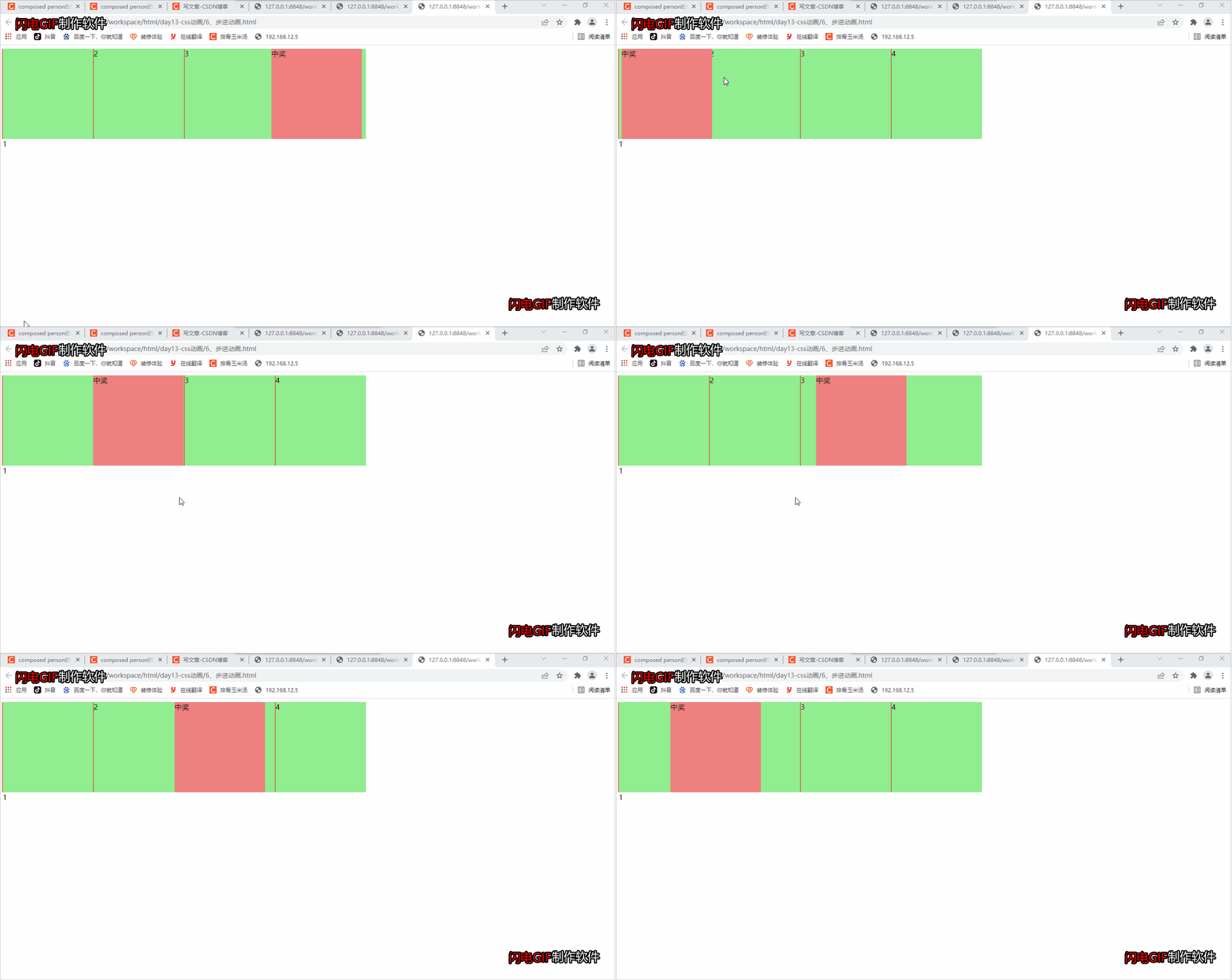
<!DOCTYPE html>
<html>
	<head>
		<meta charset="utf-8">
		<title></title>
		<style type="text/css">
        //所有div设置
			.wrapper div{
				width: 200px;
				height: 200px;
				border-left: 1px solid red;
				background-color: lightgreen;
				float: left;
			}
			//第一个div前面的隐藏元素设置,就是“马”
			.wrapper div:nth-of-type(1)::before{
				content: "中奖";
				display: block;
				width: 200px;
				height: 200px;
				background-color: lightcoral;
				animation: mybox 4s infinite;
			}
			    //    关键帧设置
			@keyframes mybox{
				0%{
					transform: translateX(0);
				}
				25%{
					transform: translateX(200px);
				}
				50%{
					transform: translateX(400px);
				}
				75%{
					transform: translateX(600px);
				}

			}
		</style>
	</head>
	<body>
		<div class="wrapper">
			<div>1</div>
			<div>2</div>
			<div>3</div>
			<div>4</div>
		</div>
	</body>
</html>
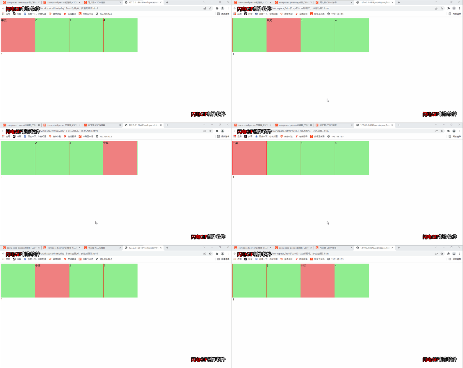
<!DOCTYPE html>
<html>
	<head>
		<meta charset="utf-8">
		<title></title>
		<style type="text/css">
            //div设置
			.wrapper div{
				width: 200px;
				height: 200px;
				border-left: 1px solid red;
				background-color: lightgreen;
				float: left;
			}

			.wrapper div:nth-of-type(1)::before{
				content: "中奖";
				display: block;
				width: 200px;
				height: 200px;
				background-color: lightcoral;
                /* start 第一帧是第一步动画结束
				   end  第一帧是第一步动画开始,默认为end
				*/
				/* steps(1,start) 等价于 step-start */
				/* steps(1,end) 等价于 step-end */
				/* animation: mybox 3s steps(4,end); */
				animation: mybox 4s step-end infinite;
			}

			@keyframes mybox{
				0%{
					transform: translateX(0);
				}
				25%{
					transform: translateX(200px);
				}
				50%{
					transform: translateX(400px);
				}
				75%{
					transform: translateX(600px);
				}

			}
		</style>
	</head>
	<body>
		<div class="wrapper">
			<div>1</div>
			<div>2</div>
			<div>3</div>
			<div>4</div>
		</div>
	</body>
</html>
 2万+
2万+


 扫一扫
扫一扫


 被折叠的 条评论
为什么被折叠?
被折叠的 条评论
为什么被折叠?
 到【灌水乐园】发言


